Monday, December 25, 2017

Longbox Junk - Solomon Kane: Red Shadows


To me, Solomon Kane is one of the most unique characters out there. . .not nearly as well known as other R.E. Howard creations like Red Sonja, King Kull, or Conan, but still a great character.

For those who are not familiar, Kane is basically a combination of The Punisher and Blade The Vampire Hunter, created long before either of those characters and set in the late 1500's/early 1600's.

 If you like dark stories about the supernatural and those who fight it, then definitely check out some Solomon Kane (Most of his earlier comic appearances are from Marvel).

ANYWAY. . .Let's do this!


SOLOMON KANE
 RED SHADOWS

DARK HORSE COMICS (2011)
SCRIPTS: Bruce Jones
PENCILS: Rahsan Ekedal
COVERS: Guy Davis

ISSUE 1


It's a bit of a strange thing, but this first issue of "Red Shadows" is not actually the first issue of the story. The main story is actually only 3 issues long and starts with the NEXT issue. THIS issue is actually a completely unrelated one shot.

That bit of strangeness aside, this first issue is really good. . .almost great! I was pleasantly surprised to see that this is one of those rare exceptions where the cover art is substantially WORSE than the interior art. It's usually the other way around.

The cover on this book is extremely crap-tastic, while the painted interior art is of stellar quality! It's grim, moody, and bloody. . .but it's also delicate and brightly-colored in places. I'm not familiar with this artist, but he is PERFECT for a Solomon Kane story!

The writing also delivers. Even though the story is a simple one. . .Kane encountering a vengeful spirit while travelling through a swamp, discovering the truth behind the haunting, and then setting things right. . .the dialogue is spot on and the story moves along quickly. It's a great read with a satisfying conclusion.

All in all, I really liked this first issue a lot, even though (as mentioned above) it's NOT the actual first issue of a continued story, but a one shot tale. It's well worth looking for.

ISSUE 2


This second issue of "Red Shadows" is actually the FIRST issue of the main story.

Taking place in France during the late 1500's the story is a simple one. . .Kane finds a raped and dying girl and swears vengeance for her. . .then proceeds to hunt and kill those responsible until only one remains, the wily swordsman and bandit, Le Loup.

As in the first issue, the cover is terrible, but the interior art is truly remarkable and a perfect fit for this kind of story. Standout moments include a gruesome page of a wolf feasting on a dead man's face. . .three panels showing the deadly fates of three of Le Loup's henchmen. . .the first face to face encounter between Kane and Le Loup, and the final full page shot of Kane at the girl's grave. But truly, each page is a fantastic work of art!

The story is also well-written, fast-paced, and engaging. It really makes you want to see what happens next.  All in all, I found this issue to be outstanding in almost every way.

ISSUE 3

Although still some very good work, I didn't like this issue as much as the previous two.

The story moves to Africa, with Kane finally tracking down his foe (Le Loup), who has tricked his way into the leadership of a native tribe. Kane is captured, but finds an ally in ousted witch doctor N'Longa. Kane is forced to battle a hulking warrior (Kulka) in front of the tribe as execution by combat. . .but things get interesting when the previous combatant rises from the dead and joins the fight!

The art is still spectacular, but not as much so as in previous issues. Standout moments include Kane and Kulka's brutal battle. . .including nut kicks, thumbs to the eye, and a knife through the wrist. The risen zombie who joins the fight with half his head cleaved off was also wonderfully gruesome and eerie. But there were also some fairly poorly executed daylight scenes. I think this artist is just better suited to dark and dreary scenes more so than brightly-lit outdoor scenes.

The writing also fell a bit flat on this one as well. Maybe it was the jungle setting, which seems like a strange choice for a character like Solomon Kane, who is more interesting stalking the dark countryside of Europe (to me, anyway).

Still, I'm not saying it's bad by any means. It's still a good read and is well-drawn. It's just not as great as the previous two issues.

ISSUE 4

Like the previous issue, this is still a very nice piece of work, but the African setting really doesn't do it any favors, and really, this is probably the weakest of the 4 issues in this series. But also as before, that doesn't mean it's bad at all.

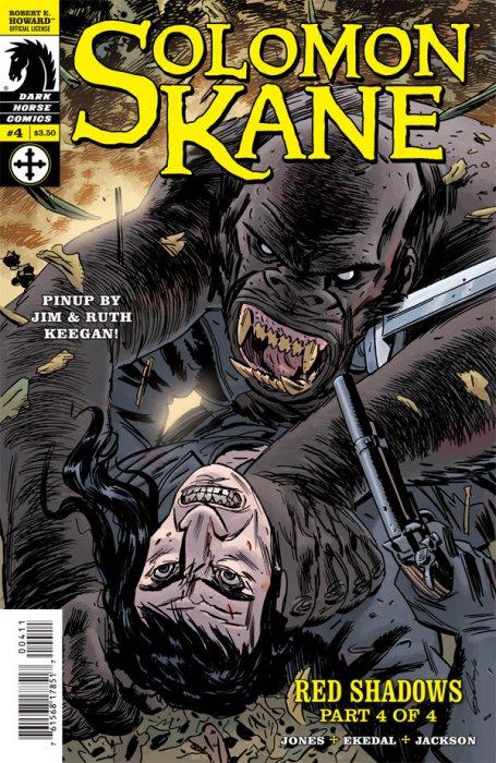
The painted, beautifully-colored art is still VERY nice! Standout moments include Chief Songa getting his face torn off by a zombie and the gruesome final fate of Le Loup as he falls into a pond full of crocodiles.

The conclusion of the story is fast-paced and exciting, if not as dark and brooding as previous issues. . .most of this issue was fighting. . .Kane and Zombie vs. Kulka, Kane vs. Le Loup, Kane vs. Kulka. . .so there naturally wasn't very much room for storytelling.

All in all, despite the odd setting for Solomon Kane and fighting taking the place of storytelling, I still found this to be a satisfying conclusion to this series.

CONCLUSION

As a big fan of Solomon Kane, I really liked this mini.  The art was spectacular and the writing was fast-paced and exciting.  The setting for the final two issues was a little strange, but it wasn't off-putting enough to keep me from enjoying the story.

 I found the first issue to be the best. . .as a stand-alone story set in a dark, haunted corner of England, it really fit the character of Solomon Kane the best.  But I highly suggest this nice little hidden gem of Longbox Junk for anyone interested in dark stories of the supernatural.

Up next. . .

It's not random "Space Marines."  Hell no! It's the United States Marine Corps in space!

Space: Above and Beyond.  Be there of be square!

Thursday, December 21, 2017

Throwback Thursday - Merry Christmas Special Edition! Batman #219

BATMAN (Vol. 1)
ISSUE 219

Merry Christmas one and all! And what better way to celebrate than to take a trip back in time to 1970 with the Dark Knight Detective? Okay. . .I'm sure there MIGHT be better ways to celebrate Christmas, but as far as holiday-themed comic book stories go, I'm pretty sure this one is generally considered to be up in the top ten.

So grab a mug of hot chocolate, plug in the Christmas tree lights, and let's do this!


WAIT!  Hold on JUST a moment! I said this was a CHRISTMAS story. . .what's with the decidedly un-Christmas-y cover here?  Well. . .as it turns out, this is sort of a stealth Christmas tale.  You'd never know it from the cover because, unlike today's "12 issues to tell a single story",  there's three stories in this issue.  The Christmas story is the second story.  So let's not leave the first story out in the cold and take a look. . .

DEATH CASTS THE DECIDING VOTE
SCRIPT: Frank Robbins
ART: Irv Novick & Dick Giordano

Bruce Wayne goes to the state capital to try and get government funding for a social services program he's come up with.  While there, he meets a senator who wants to combine an anti-crime bill with Wayne's social services program and so Bruce Wayne and the Senator fly to Washington together to work out the details.

The plane is hijacked midway by thugs working for an organized crime syndicate wanting to delay the Senator's arrival in Washington so that he will miss a crucial vote and his anti-crime bill won't pass.  Through a series of misdirections and tricks, Batman AND Bruce Wayne take down the hijackers and the Senator arrives in Washington unharmed and able to pass the anti-crime bill.

This is really more of a Bruce Wayne story than a Batman story, as the number of witnesses on the plane limit Bruce's ability to gear up.  I found the story to be interesting, but ultimately forgettable.  It was nice to see a more Bruce Wayne-focused story, but it just seemed that the writers felt they HAD to force Batman in there somehow, and really it weakened the story.  I'm not saying the story was BAD, it just wasn't really as good as it COULD have been if it would have focused more on Bruce Wayne taking down the hijackers while preserving his secret identity.

The art on this story was really very nicely done, except that the artist couldn't really draw the airplane itself very well and some of the action scenes were not that great.  The coloring was also pretty sloppy in places.  On the other hand, faces were very well done, with even random thugs having their own individual appearance.  

Overall, this was a decent little story with good art.  The coloring could have been better and the story could have been better by focusing on Bruce Wayne solving a situation without Batman, but the good outweighs the bad here.

And now on to the Holiday portion of our trip back to 1970. . .

THE SILENT NIGHT OF THE BATMAN
SCRIPT: Mike Friedrich
ART: Neal Adams & Dick Giordano

It's Christmas night in Gotham City and Batman is summoned to GCPD headquarters by the Bat-Signal, only to find out that there's no emergency.  Instead, Commissioner Gordon tells Batman that even HE deserves the night off on Christmas and invites the Caped Crusader to sing some Christmas carols with the department.  Batman is skeptical, but decides to play along until something comes up.

As Batman sings with the police officers, scenes of crimes ALMOST happening, but stopping for one reason or another are shown, until the sun rises and Batman realizes that for once he wasn't needed for the entire night.

This is definitely a great comic book Christmas story!  There's a bit of a strange moment where Batman sees. . .or THINKS he sees. . .a ghostly spirit and it doesn't really make much sense, but other than that, the story here is nice and tight.  It's not very long at all and actually, most of the story is told through visuals. . .silent vignettes of crimes almost happening with the lyrics of Christmas carols Batman is singing as the background, so the art does most of the heavy lifting. . .and does a fine job of it. This is a very nicely illustrated little story. 

 If you can get past the modern grim-n-gritty portrayal of Batman enough to think that him singing "Silent Night" with a bunch of cops isn't silly, then this story will definitely hit the holiday sweet spot.  I can see why this is considered a bit of a classic.

And finally. . .

TIME TO KILL
SCRIPT: Henry Kuttner
ART: John Guinta
Reprinted from The Phantom Stranger #5, 1953

For some strange reason, they decided to throw in a weird little sci-fi story reprinted from 1953 without Batman into Batman. . .don't know what the hell that's all about, but it's there, so let's take a look.

A scientist travels into the future to assassinate another scientist that he has had a bitter rivalry with for many years.  He is successful and returns to the past to take credit for the other scientist's work, satisfied that nobody will ever suspect him for a murder that hasn't taken place yet. . .but in a strange twist of fate, it turns out that the person that he killed was. . .himself.

Even though the inclusion of this story was a bit confusing, I have to say that I really liked the "Twilight Zone" style of it, and if I'm honest, I really liked it the most of the 3 stories in the issue!  The art wasn't particularly strong, but it wasn't bad at all. 

CONCLUSION

This comic book was DEFINITELY a mixed bag. . .and not in a bad way.  The main story focused (mostly) on Bruce Wayne instead of Batman. . . then there was a short and sweet  Christmas story with Batman belting out "Jingle Bells" with the cops of the GCPD. . .and THEN a strange sci-fi time travel tale with a twist that had nothing at all to do with Batman.  And really, not a bad story among the three!  

Overall, I don't think this issue will appeal very much to Batman readers who prefer the "Post-Miller" Grim-N-Gritty Batman, because honestly, the Batman portrayed here can be seen as a bit silly through a modern lens. But if you're just looking for a good, fun read without a lot of darkness and angst this issue definitely hits that nostalgia spot.

To the fine readers of this blog, I thank you and heartily wish you a Merry Christmas, a happy and prosperous New Year, and many more to come!


Monday, December 18, 2017

Longbox Junk - The Brave and The Bold Part 2

THE BRAVE AND THE BOLD
PART 2
ISSUES 191, 192, 195 & 196


Welcome back to the series that's like that one guy at work who just does what he has to do and nothing else. He knows he's never going to get a great review from management, but he doesn't care as long as he just gets paid.

ISSUE 191

SCRIPT: Cary Burkett, Gary Cohn & Dan Mishkin
PENCILS: Jim Aparo & Dan Spiegle 
COVER: Jim Aparo

In a strange turn of events, Batman and Joker team up to find the truth after Penguin is killed and Joker is framed for the death. Will you be surprised if I tell you it's the worst team-up ever? Didn't think so. . .

This unlikely team-up between Batman and Joker was actually pretty good. . .in an 80's hilarity way, of course.

The Aparo art is barely passable and the story is thin and ridiculous, but you have to love the gymnastics needed in order for this teamup to take place. Then there's the hilarity of Joker trying to kill Batman twice "Out of habit" during their partnership, the ridiculous "Jokermobile", and how Batman finds Joker by just going up to his "Ha-Hacienda" and knocking on the door.

Even Grant Morrison stayed clear of THESE events. And that's saying something.
All in all, this was actually decent, but only for the "Really?" factor.

ISSUE 192

SCRIPTS: Mike W. Barr & Cary Burkett
PENCILS: Jim Aparo & Dan Spiegle
COVER: Jim Aparo

It's time travel madness as C-List villain I.Q. somehow manages to make a time machine from parts bought at a local electronics shop, sending Superman back in time so he won't interfere with his nefarious schemes. . .but accidentally pulling Superboy forward so he can team up with Batman to take him down. Oops!

Pretty bad.

Aparo's art is better than usual on this one, and the cover is actually pretty cool, but the time travel shenanigans needed to force the Superboy/Batman teamup are so weak it's ridiculous.

And then there's Superboy fashioning long underwear out of lead to resist the Kryptonite the villian has for. . .reasons? No. EIGHTIES reasons! That's it.

So bad. No bueno.

ISSUE 195


SCRIPTS: Mike W. Barr
PENCILS: Jim Aparo
COVER: Jim Aparo

Vampires have come to Gotham! Batman and Andrew Bennett (I. . .Vampire) team up to rid the city of filthy bloodsuckers and, in doing so, save the daughter of a mob boss before she turns into a cursed creature of the night!

I found this issue to be a lot of fun and a good read. The writing was grim and moody (mostly from Andrew Bennett's miserable perspective) and a nice change from the goofiness of some of the previous issues.

Also, unlike some of the other Brave and Bold stories that are extremely dated, I think this one holds up pretty well today.  Another decent example of when this series did things right.

ISSUE 196

SCRIPTS: Robert Kanigher
PENCILS: Jim Aparo
COVER: Jim Aparo

After Ragman saves Batman from a trap, they team up to take down a group of domestic terrorists. All that AND the origin of Ragman!

To me, Ragman has always been sort of an unnecessary character. This issue is no different. It's not terrible, but the writing is overblown in trying to be dark and grim, but just doesn't pull it off in the way the I. . .Vampire teamup in the previous issue did. Here, it just comes off as trying too hard. That and Ragman's origin is just ridiculous, no matter WHO writes it (at least in his original form. The revamped origin in the 90's was better).

All in all, like Ragman himself, I found no real reason for this to exist.
It was utterly average in every way.

CONCLUSION

This handful of Brave and Bold really only had ONE good issue in it.  I don't have the full run, but I have the definite feeling that's the basic ratio.  Even from the limited number of issues I do have, it's pretty plain to see that this was a series that really didn't try too hard. . .

Up next. . .

Meet a man who has denied himself all pleasure except for the beautiful screams of the wicked. I'm talking about R.E. Howard's grim puritan himself, Solomon Kane, in Dark Horse's "Red Shadows" mini.

Be there or be square!

Monday, December 11, 2017

Longbox Junk - The Brave and The Bold Part 1

THE BRAVE AND THE BOLD
PART 1
ISSUES 176, 184, 185 & 186


Welcome back to the 80's!  Smell that cheap paper, boy! SMELL IT!

That's right.  We didn't need fancy paper in my day.  And stories that made sense?  Didn't need those either.  You kids don't even know how good you got it now.  I had to buy MY comics from the grocery store.  One story in every issue.  None of that continuity crap you kids talk about.  Didn't need it. NOW GET OFF MY LAWN!


ISSUE 176

SCRIPT: Cary Burkett
PENCILS: Jim Aparo
COVER: W.M. Kaluta

Batman and Swamp Thing accidentally cross paths in the Louisiana Swamp when Batman discovers that Selina Kyle's Sister, Felicia (in her only appearance. . .or mention. . .ever) is in danger. 

Overall, I feel that this is one of the better issues on the back end of Brave and Bold.

The cover by Kaluta is great, for starters. The interior art by Aparo is pretty good. The colors are a bit dodgy, but hey. . .80's right? The story is a bit convoluted, but really written quite well. It's more thoughtful and grim than one would expect to find in a mainstream 80's superhero team up book.

All in all, this is a good example of when this title got it right. Nicely done.


ISSUE 184

SCRIPT: Cary Burkett & Mike W. Barr
PENCILS: Jim Aparo & Dan Spiegle
COVER: Jim Aparo

This Christmas issue teams up Batman and Earth-2 Huntress (Helena Wayne), putting Bats into a somewhat awkward and confusing father/uncle/partner position. 

When Batman finds evidence his father was actually bankrolling mobsters, he decides to quit being Batman, leading to some scenes of sad Bruce Wayne trying to party it up, but failing. Eventually (of course) Huntress helps him find the truth and Christmas is saved! YAY!

Overall, this was a pretty good issue. The cover is basically pre-internet clickbait, which makes it sort of awesome. 

The interior art is better than I usually expect from Aparo, and the whole concept of Earth-2 is nicely summed up in a page or two where today an entire issue would be needed. 

All in all, this was a pretty good issue. Not great, but not bad at all. But someone needs to get Huntress a coat for Christmas if she's gonna be swinging around Gotham in the snow wearing a purple swimsuit.


ISSUE 185

SCRIPTS: Cary Burkett & Don Kraar
PENCILS: Adrian Gonzales & Dan Spiegle
COVER: Rich Buckler, Sr.

Green Arrow and Batman team up to take down Penguin after he tricks them both like chumps with his previously-unknown (and never mentioned again) ability to create perfect robot versions of Black Canary and Robin. Who knew? 

Okay. . .this one was pretty bad.

Bad cover, bad interior art, ridiculous story, just. . .bad. 

This issue is a perfect example of how wrong this title could go. Moving along.


ISSUE 186

SCRIPTS: Cary Burkett, Gary Cohn & Dan Mishkin
PENCILS: Jim Aparo & Dan Spiegle
COVER: Jim Aparo


Batman and Hawkman provide an outstanding example of using too much power to solve a problem when they team up to take down C-List antiquities thief Fadeaway Man while completely ignoring the Penguin standing right there!

Another pretty bad one.

Glaring pink (PINK!) cover. Extremely contrived team-up. A weak villain who didn't really need both Hawkman AND Batman to bring down. A ridiculous scene of Batman ripping off a mask to reveal he's wearing his complete cowl beneath it.  

And okay. . .speaking of Bats and his miraculous mask, let's talk about Aparo a minute. Can we just say it? Except when someone is wearing a mask, everyone looks the same. You literally cannot tell the difference between Carter Hall and Bruce Wayne in this issue. Please don't tell me I'm the only person who has ever noticed this.


CONCLUSION

This first batch of Brave and Bold was hit and miss.  And when it misses, it misses big.  It's almost hilarious how bad issues 185 and 186 are.  Of course, you can't expect the bar to be TOO high on what was pretty much the 80's printed version of shovelware social media games. . .newsstand clickbait meant to gather money from kids who haven't learned the difference between good and crap yet.

That's right.  I said it. 

Up next. . .

More Brave and Bold. 
Batman teams up with Joker, Superboy, I. . .Vampire, and Ragman. 

Be there or be square!

Monday, December 4, 2017

Longbox Junk - The Crow: City Of Angels

THE CROW: CITY OF ANGELS

City of Angels was the sequel to The Crow. . .and in my humble opinion, the only decent sequel.

I like the movie quite a bit, which probably puts me at odds with a lot of Crow fans who (according to reviews I've read) hated it for being even darker and more relentlessly depressing than the original, with not even the small bit of light and hope represented by young Sarah and the detective from The Crow.  The second movie is so grim that the ending was changed so there would be SOMETHING happy in it.

But that's the movie.  This is the comic book tie in.  Let's take a look, shall we?

Kitchen Sink Comix (1996)
SCRIPT: John Wagner
PENCILS: Dean Ormston
COVERS: Tim Bradstreet

ISSUE 1

This 3 issue series is the comic book adaptation of the second Crow movie. It follows the original script, rather than the version that was released in theaters, so there are a few departures, especially the ending, which is completely different.

For a 1990's movie tie in from a small press, this book has some pretty serious talent behind it. . .John Wagner on scripts, Dean Ormston on art (probably better known for Vertigo work and more recently, Dark Horse's Black Hammer) and awesome covers by Tim Bradstreet.

The story is extremely dark and isn't going to be for everyone. It starts right off with a literal bang as Ashe Corven is forced to witness his son being shot in the head before he too is shot and they are both dumped off a pier.

The spirit of vengeance known as the Crow finds kindred soul Sarah and leads her to the pier to witness Ashe's resurrection. She explains that he's only back long enough to get his revenge and as he struggles to accept that, the issue ends.

Overall, I felt the story was a bit rushed. It seemed extremely compressed. It wasn't BAD, though. . .it's actually quite good. But like I said, it's a very dark tale and those with delicate sensibilities (those who need safe spaces because elections don't turn out the way they like, for example) might just want to steer clear entirely.

The art is definitely unique here. It's very boldly inked. . .incredibly detailed in places, yet very vague in others. I can see how this style can be a very "love it or hate it". I don't love it, but I think it fits the dark and apocalyptic tone of this story very nicely.

ISSUE 2

This middle issue focuses on Ashe hunting and killing his way through the gang members who killed him and his son. Also, as Judah Earl learns of the deaths, he consults Sybil (a blind psychic) and learns about the Crow. He captures Sarah in order to lure both Ashe and The Crow to him.

I felt this middle issue slumped a bit. Once again, it felt extremely rushed and compressed. The dialogue was pretty cheesy in places as well. You can tell this was definitely written with a Goth audience in mind as Ashe spouts dark poetry while in the middle of dealing bloody death. It's hard to care about any of the deaths when there was so little context beyond "You killed us". I'm thinking this series could have used a 4th issue to slow things down and give a little more meaning to events.

The art also shows a bit of weakness in this issue. It's still extremely dark and brooding in its own unique way, but it comes apart a bit during more bombastic scenes of violence. And the artist struggles with motorcycles which figure in a key sequence.

Overall, this issue was still pretty good, but not as good as the introductory issue.

ISSUE 3

This final issue picks up quite a bit as it explores the dark mythology of The Crow a bit more now that Ashe's trail of death has led him to Judah Earl.

Earl captures The Crow and kills it, using its blood to take on its powers for himself and leaving Ashe vulnerable to injury and pain, even though he still can't die.

This issue also has the most departure from the movie in two scenes. . .one where the spirit of Ashe's son tells him he's finished with his mission of vengeance and if he doesn't return, they'll be separated forever. Ashe decides to stay and rescue Sarah.

The second departure from the movie is the ending. In the movie, Sarah, Danny, and Ashe are united as spirits in the afterlife for a fairly happy ending to a pretty grim movie. In the ending to this series (the original ending in the script), because he stayed to rescue Sarah (who was killed by Judah Earl anyway), Ashe is doomed to roam the earth forever as an undead spirit. Quite a bit darker.

Unfortunately, the impact of the grim ending is lessened by the rushed telling of the story. . .something that has been a fault of this series since the first issue, but overall, this was a satisfying ending to this dark and violent series.

CONCLUSION

As a fan of the movie, I liked this mini.  If you aren't already a Crow fan, or are a sensitive type, this will probably not be your cup of tea.  I liked that it was based on the original script, even though that meant the ending was definitely NOT a happy one.  The art was unique, and not really my favorite style, but it fit the grim and unearthly tone of this particular story very nicely.

My main problem with this mini was that it felt extremely rushed and compressed from start to finish.  It probably would have benefitted from a 4th issue to give a bit more impact and meaning to events that seem almost disconnected in the finished product.

Up next. . .

Even though I don't have the full run of the series, old school Brave and Bold are pretty much all one shots anyway, right?  So let's head back to the 80's and take a look at some crazy team-ups!

Brave and Bold. . .Batman teaming up with Swamp Thing, Huntress, Green Arrow, Hawkman, Joker, Superboy, and I. . .Vampire.  Be there or be square!

Friday, December 1, 2017

Longbox Junk - Two Shots Part 2: The Thing From Another World & Punisher

TWO SHOTS
PART 2


More Two Shots. . .and I've got a couple of GREAT ones this time out, folks! 

THE THING FROM ANOTHER WORLD 

Dark Horse (1991 - 1992)
SCRIPT: Chuck Pfarrer
ART & COVER: John Higgins

ISSUE 1

Where to start? I found this first issue to be excellent in every way!

The story is a fast-paced direct sequel to John Carpenter's 1982 horror masterpiece "The Thing" and maintains the movie's tense atmosphere, but not so much as in a "We're all locked in here together with a THING!" way as in a "There's a goddamn THING and I have to prevent it from escaping!" way as a team of Navy SEALS investigate the ruins of Antarctic Outpost 31 and find MacReady the sole survivor admitting to killing everyone and babbling about aliens and infections.

Of course, the alien latches onto these new life forms and the SEAL team is decimated one by one until only MacReady and Erskine (the commander) are left.

The art is beautifully painted by John Higgins (Who I knew mostly as a colorist) and is hyper kinetic and gruesome. The colors on this book are FANTASTIC! The bright splashes really pop in the dull Antarctic scenery.

Overall, this comic should have been filmed as the sequel to the movie. It's that good.  Well done, Dark Horse!


ISSUE 2

In the second issue, the stakes get even higher as MacReady, Childs, and Erskine go to a large Argentine base with hundreds of people. An infected Erskine escapes the base after calling a submarine for extraction.  MacReady and Childs corner the alien as it decimates the submarine crew.

In the end, Childs sacrifices himself so that MacReady can escape to tell the tale before the submarine is sunk and destroyed, once again leaving MacReady as the sole survivor.

The art remains impressive in every way as the bleak Antarctic landscape changes to the base buildings and submarine interior. One sequence of Childs on a rope in a crevasse with the alien below him lit with a flare was unbelievable, how good it was! I tell you, the colors really elevate this book.

CONCLUSION

If you are a fan of horror movies or horror comics, you owe it to yourself to find this great little two shot from Dark Horse's early days! This story really delivers where other horror comics barely show up.  Even if you don't really like horror comics and want to know what a sequel to the horror classic "The Thing" would have looked like, take a look at these comics and find out.  

THE PUNISHER: TRIAL OF THE PUNISHER

Marvel (2013)
SCRIPT: Marc Guggenheim
ART:  Leinil Francis Yu (issue 1) & Mico Suayan (issue 2)
COVERS: Leinil Francis Yu

ISSUE 1

What happens when The Punisher just walks into a police station with a dead assistant D.A. in a duffle bag and gives himself up? The trial of the century! Of course, nobody wonders WHY Frank Castle gave himself up and is willing to stand trial. . .everyone just assumes he's crazy and leaves it at that.

I really liked this first issue a lot. You KNOW that Punisher is doing it for a reason, and so does his Public Defender, but this is an interesting take on the Marvel Universe legal system, where it's just assumed every superhero and supervillain is insane in some way.

The art in this book is especially impressive. Probably one of the top 10 best looking Punisher books I've ever seen. It's dark, gritty, and super detailed in such a good way that every page is a true work of art!

Overall, this issue is a winner in every way. Nicely done, Marvel!


ISSUE 2

So we get an artist switch on this second issue, which would normally be a red flag not being able to keep a team together for TWO lousy issues. . .but this time, I don't even care because the art on the second issue is even MORE impressive than on the first (and the first was damn good)! It's super-detailed and dark. . .almost like Tim Bradstreet's cover work. There's a 4 page scene flashing back to Daredevil and Punisher fighting that was a true standout in a book where EVERY page is a work of fantastic art.

Storywise, Punisher finally makes his move. It turns out that he had a target that was on the Federal Witness Protection list that he couldn't find, so he needed to be in the courthouse on the day of THAT trial, and he knew the security would be so tight that there was no way he was sneaking in. It really showed the strategic side of Frank Castle, but I still couldn't help but think that they would have had a lot tighter security on THE FRIGGIN' PUNISHER than some mob boss.

All in all, I really enjoyed this story, even if it DID seem to be a bit of an excuse to put The Punisher into a legal setting instead of his regular combat scenarios. It was really worth it for the art alone.


CONCLUSION

Despite wondering why they didn't have a lot more security on a man known for killing hundreds and constantly escaping the authorities, I really liked this unusual little Punisher story.  The art was more than worth the admission price alone on this one.  If you like The Punisher, you'll love this story.  If you don't, then it's not going to do a thing to change your mind.  In other words, very well done, but pretty much for fans only.

So there they are. . .two GREAT little two-shots! I highly suggest both of them.

Up next. . .

The comic book adaptation of the movie sequel to a comic book adaptation movie.  

Wait.  Did I get that right?  

The Crow: City of Angels 3 issue mini.  

Be there or be square!