HEY-O! It's the thirteenth entry in this year's Longbox Junk Halloween Horror party! So, to mark the occasion, let's take a look at a Friday the 13th comic book.
I have to admit that I'm not a big fan of the Friday the 13th movies. They're okay and I'll watch them, but they aren't exactly the kind of thing I'll purposely look for, and I'm no expert on the timelines and trivia of the franchise. The movies to me are just okay.
Don't get me wrong. . .there's nothing wrong with it at all if you happen to be the biggest fan of Friday the 13th there is. We're all fans of something and that's what makes the world a great place in my book.
ANYWAY. . .
Back in 2007 Wildstorm (DC) got the comic rights to Friday the 13th, Texas Chainsaw Massacre, and Nightmare on Elm Street. They WERE going to try and set up a whole horror comic mini "universe" with rebooted ongoing monthly series for all three franchises.
How it ended up was that the comics weren't as popular as they THOUGHT they would be, so the ongoing monthly titles were quietly changed to miniseries and future projects were standalone one shots and minis until the whole thing just sort of faded away after a while. . . another failed and forgotten project in the wonderful world of comics.
What we have here is the first issue of the Friday the 13th series. Let's take a look inside and see if we can find out why this title only lasted six issues. Was it just a bad break for a good comic, like I've seen quite a few times? Or does this series deserve its current home in the bargain bin?
Let's find out!
FRIDAY THE 13TH #1
WILDSTORM/ DC (2007)
COVER: Ryan Sook
FRIDAY THE 13TH
SCRIPT: Justin Gray & Jimmy Palmiotti
PENCILS: Adam Archer
INKS: Peter Guzman
THE COVER:
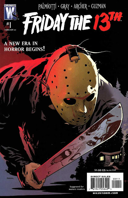
Ryan Sook is a great modern comic artist, and he doesn't disappoint here! It's a simple, detailed portrait of the iconic slasher, Jason Voorhees. I really like the overall composition, with the unusual angle of view on Jason and the victim reflected in his machete. No doubt about it, this is a fantastic Halloween cover! Let's see what's inside. . .
THE STORY:
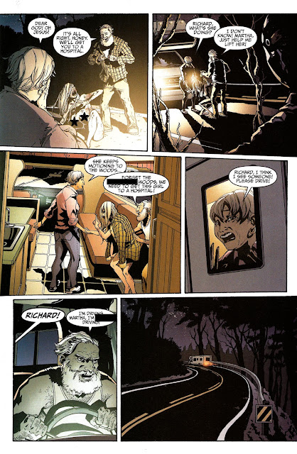
We begin with a short prologue. A young blonde woman is being chased through the forest by Jason Voorhees. She stumbles into the road, where an elderly couple find her and take her to the local hospital.
Later, we see that she's incoherent and lashes out at anyone coming near. The doctor tells the Sheriff that he'll probably never be able to get her to talk about what happened at camp Crystal Lake.
Flashing back to two weeks previously, we are introduced to a group of young men and women making their way to Camp Crystal Lake. They've been hired to clean and prepare the camp for a re-opening.
The new owner explains that he plans to make a big profit from the camp's deadly history, exploiting the reputation of "Camp Blood" by appealing to those who enjoy the thrill of staying in a place where multiple gruesome murders have been committed.
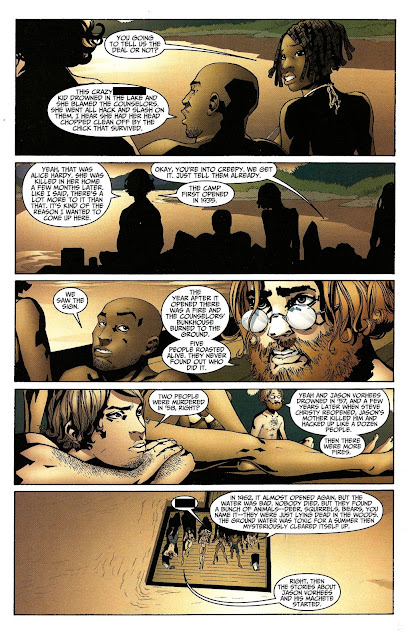
We follow the young workers as they make themselves comfortable in their new temporary home. While some explore the cabins, a group decides to go swimming in the lake. One of them, a bit of a social outcast, has researched the history of the camp and tells the rest of them the gruesome details of Camp Crystal Lake.
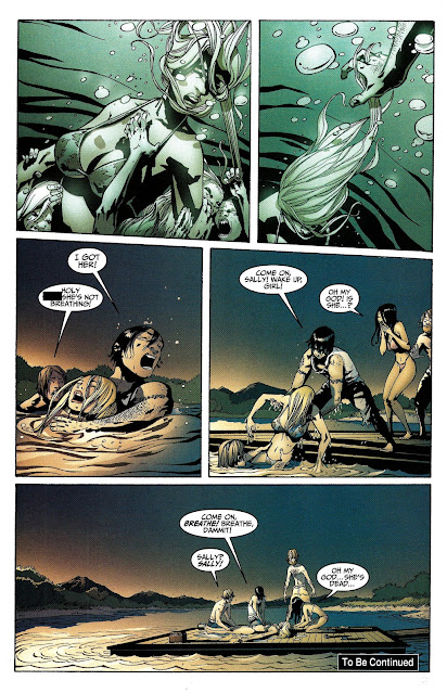
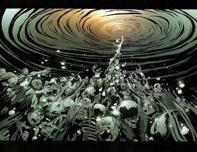
As the rest listen to the bloody history of the camp, one of the group goes swimming. To her horror, she finds herself being dragged down into the depths by (what I assume are) the spirits of those killed over the years at the camp.
The rest notice her struggling and manage to pull her out of the water, but it's too late. She's drowned. Camp Crystal Lake has claimed another victim!
To be continued. . .
THE REVIEW:
Okay. . .Hmmm. . . Let's break it on down!
When it comes to first issues of a new series, I have a pretty low bar for what I consider success. Two things. Just TWO things! You'd be surprised how hard it seems to be for publishers to get over that low bar.
First, does it introduce the characters and their situation in a new reader-friendly way? In other words, can I just come right in on the first issue and understand what's going on? Second, does it make me want to read the next issue?
This issue spends a lot of page space on exposition regarding the history of Camp Crystal Lake. Truth be told, this issue is MOSTLY setup and introduction. Not that it's a bad thing. . .after all, this WAS supposed to be an ongoing monthly instead of a six-issue mini.
So, I'll give it a half and half on the first one. It does a good job of introducing the characters and their situation. . .unfortunately, the characters just aren't that interesting. You KNOW from the prologue that all of them are going to die except one. This doesn't put much of a burden on the writer to make the characters interesting.
As far as the second point goes. Does this make me want to read the next issue? Well. . .not really. It's sort of bland, while at the same time, it tries a little TOO hard to be "adult" with profanity liberally sprinkled throughout (see the page scans above. I had to edit them because there is barely any pages that don't have profanity).
I know my swear words. I even still use them now and then when my wife isn't around. I ALSO know that profanity is like black pepper. . .a little sprinkle is fine, but too much ruins the flavor. There's a little too much pepper in this one. They try too hard to spice up a pretty bland and uninteresting story.
As far as the art goes. It's. . .okay. If I had to describe it in one word, that word would be "Serviceable". It helps tell the story but doesn't try to do anything over that bare minimum requirement. About the only standout moment is a nice double page spread of the first victim being dragged down into the lake I forgot to put above, so I'll put it here. . .
Click to expand for full effect!
But other than that, the art is just sort of. . .there. I have to admit that IS a nice double pager, but that's it for good art moments.
CONCLUSION
Truthfully, this issue doesn't really have much going for it unless you happen to be a Friday the 13th superfan. If you ARE, then I think you'll definitely like this series. If you aren't, then it's probably safe to say that you can skip this one and read some better horror comics that are out there.
With most of the issue being taken up with exposition and background, it DOES do a good job of introducing the characters and their situation. Too bad both are sort of lackluster. Aside from the fantastic Ryan Sook cover and a nice double page spread, the art is just sort of there. . .telling the story. . .not trying very hard to do anything else.
Overall, I can see why this series didn't really take off. It didn't get an opening issue that would hook anybody but big fans of all things Friday the 13th. For casual readers, it's very skippable.
Disappointing, but I guess they can't ALL be winners.
Up Next. . .
It ain't over until it's over! MORE Longbox Junk Halloween Horror to come!
Be there or be square.


No comments:
Post a Comment