Showing posts with label MAX. Show all posts

Thursday, October 27, 2022

Longbox Junk Halloween Horror 2022 Part 14 - Dead of Night Featuring Man-Thing #1

Welcome to Longbox Junk! You want comic reviews you never asked anyone to write? You're in the right place!

The time is short.  The witching hour is almost upon us.  Halloween is just a few days away, but the Longbox Junk Halloween Party is still going!  LET'S DANCE!

Man-Thing is one of those Marvel characters that's been around for a while but isn't really known about by casual comic culture fans.  He's had a few short ongoing series in the past, but these days he just kind of pops up every now and then before shuffling back off to the swamp.  So, he's not the most visible Marvel character, but Man-Thing's got his fans. . .and I'm one of them!

That said, Man-Thing has recently had a moment in the popular culture spotlight with an unexpected live appearance on the Werewolf By Night Disney+ special (And if you haven't seen it yet. . .it's a fantastic show. Check it out.  Go! NOW!).  So, since he's getting a little bit of attention this year, how about we invite Man-Thing to the party?

Let's do it!
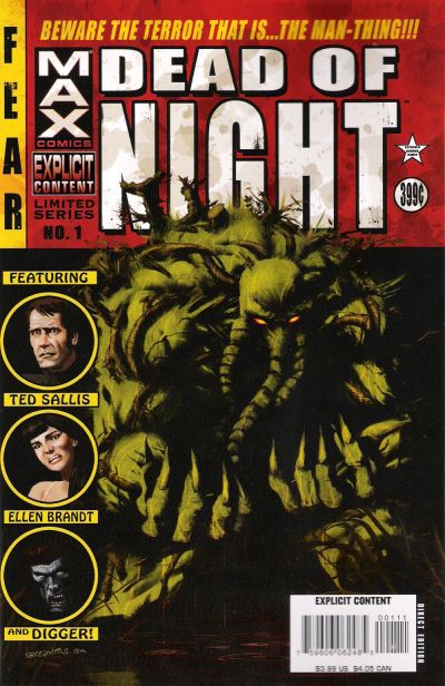
DEAD OF NIGHT
FEATURING MAN-THING #1
Marvel MAX (2008)


COVER: Kaare Andrews

THE COOL DARK: Part One

SCRIPT:  Roberto Aguirre-Sacasa
PENCILS: Kano & Nick Percival (Framing Sequence)
INKS: Kano & Nick Percival (Framing Sequence)

THE COVER:

I like it!  It's not the BEST Man-Thing cover out there (that would probably be Frank Brunner's cover for Man-Thing #1), but I like the Golden Age pulp mag homage.  The giant red title block is certainly an eye-catcher.  Man-Thing himself is pretty nasty looking. . .a bit more on the horror side than we normally see him.  Not bad.  Let's get inside!

THE STORY:

We begin with an introductory framing sequence.  Digger, the former "host" of Tower of Shadows and Chamber of Darkness, is our narrator. . .


Deep in the swamps of the Florida panhandle, researcher Ted Sallis, along with his lab assistant/ fiancĂ©e, Ellen Brandt, and fellow scientist, Eric Schist, are hard at work on a secret government project to recreate the lost Super-Soldier serum that gave Captain America his powers during World War II. 

Their work is almost complete and government agents are due the next day to take their research to Washington D.C. Ted is relieved that the end is near and is looking forward to his and Ellen's marriage. 


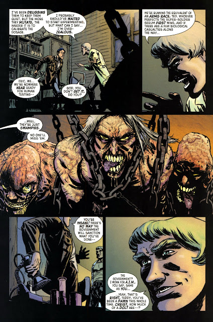
Late that night, Ted hears strange noises from a shack in the swamp behind their secret lab.  When he investigates, he is horrified to discover mutated creatures imprisoned within!  Eric arrives and tells Ted that he has started human trials despite Ted saying they aren't ready. . .and the creatures are swamp dwellers that he has been experimenting on.

Ted protests and threatens to reveal Eric's unethical experiments to their government employers.  Eric taunts Ted, revealing that they have been working for the terrorist group, A.I.M. the whole time, and that Ted is but a pawn in their plans!


Ted manages to knock Eric out, then rushes to the lab to gather his research and the only sample of the new formula.  He plans to escape and take the research to the government.  But as he hastily gathers his notes, Ted is confronted by Ellen. . .who holds him at gunpoint and reveals that she is also an A.I.M. agent!

Ted realizes his life has been a lie when Eric returns, and he sees the obvious affection Ellen has for him.  Desperately, he dives out a window and runs into the swamp, but is shot in the back by Ellen as he flees. . .


As he sinks into the muck, dying, Ted swallows the vial of experimental formula.  Something happens that night. . .the formula somehow reacts with the swamp water and somehow Ted rises from the grave, but not as a man. . .as a thing! A MAN-THING!


Late that night, the hulking monster that was Ted Sallis returns to the secret lab.  After freeing the mutated humans from the hidden shack, he bursts into the lab, stunning Ellen and Eric with his terrifying and inhuman appearance!  


Man-Thing quickly kills Eric, then turns to Ellen. . .but something stops him.  Is there still a part of Ted Sallis inside the creature that feels pity as Ellen begs for her life?  If there is, it's gone again in a moment as he reaches out and horribly burns the woman with his very touch!


And, having his revenge, the Man-Thing leaves Ellen alive and horribly disfigured as he walks back into the dark water of the swamp, leaving his former life behind.


The End. . .To Be Continued.

THE REVIEW:

What we have here is a modern retelling of Man-Thing's origin.  And I have to say that it's a darn fine read!  It's a simple story that introduces Man-Thing quite well, leaning HARD into the horror elements of the character.  It's nicely written from the perspective of Digger telling the tale and has enough meat on the bone to not only be a good standalone tale, but to make me want to see what happens next!

The art is a great match for the dark tale of betrayal and revenge, with lots of shadows and fine detail.  The artist has a little trouble with human faces.  You can definitely see that his wheelhouse is in the macabre and monstrous elements of the story.  His version of Man-Thing is powerful and terrifying. . .a force of nature unleashed!  That said, I sort of wish that the artist who painted the framing story would have done the whole thing.  The painted Digger sequences are simply superb!

CONCLUSION

Although this is the first issue of a four-issue mini, it stands alone quite nicely.  It's a great modern re-telling of the origin of Man-Thing that I would certainly recommend to anyone wanting to know about the character without having to get into expensive collections or more expensive Bronze Age back issues.  It's the same basic story, but in a modern style and at bargain bin prices.  WIN!

I would also recommend this issue to any horror comic fans who are just looking for a decent little one-shot story with some dark monster fun.  Yeah, it's a Marvel Universe character, but there's nothing superhero about THIS story.

Overall, this is a nice little nugget of Longbox Junk gold!  It's the kind of thing I love to find while bargain bin diving.  It's not really "worth" anything to collectors, but it's definitely worth picking up if you should spot it.

Up Next. . .

There's not much October left, but we're turning up the music and keeping the Longbox Junk Halloween Horror party going!

Be there or be square.


Monday, February 17, 2020

Longbox Junk - One Shots (part 1)

Welcome to Longbox Junk, the comic blog stuffed absolutely full of reviews you never asked for!

One shots! I DO love the one shots!

I have a LOT of one shots in my collection. They're actually my favorite kind of comic book. Not that I mind following a favorite character month to month, but there's definitely something to be said for having a complete story in one issue. No cliffhangers. No waiting. One issue. . .that's it.

In my extremely humble opinion, the one-shot is a true test for comic book creative teams. They have very limited space to craft a complete narrative. Because of that limitation, one shots can be a bit of a mixed bag. Some teams simply aren't up to the challenge. Others manage to create often-overlooked nuggets of pure comics gold.

Let's take a look at this handful of one-shots and see what we get!  I'm still trying to keep things a little shorter, so I guess we'll see how that works out as well.  Ready? Let's do it!

ONE SHOTS (Part 1)

HELLBOY: 2017 WINTER SPECIAL
DARK HORSE (2017)

COVER: Sebastian Fiumara

First off. What an absolutely fantastic cover! Definitely worthy of a turn on the rotating office wall comic cover display. It captures the spirit of Hellboy perfectly.

There are three short unconnected stories in this special, let's take a look at them individually. . .

THE GREAT BLIZZARD
SCRIPT: Mike Mignola & Chris Roberson
PENCILS: Christopher Mitten

This story doesn't feature Hellboy or any of the B.P.R.D. characters, but some characters I'm unfamiliar with who seem to be paranormal investigators in the 1800's (David Grey and Sarah Jewell). The art is very nicely done on this one, and the dialogue between the characters is snappy. The story is very short, but well written, and I wouldn't mind finding out more about these characters.

GOD REST YE MERRY
SCRIPT: Mike Mignola & Chris Roberson
PENCILS: Paul Grist


A tale set at Christmas in the 1950's starring Hellboy and Professor Bruttenholm versus a possessed Santa Claus. It's played for laughs and the art isn't great. . .very cartoony. I got a chuckle out of Hellboy getting an ugly sweater for Christmas, though. Probably the worst of the three. Still, not terrible.

THE LAST WITCH OF FAIRFIELD
SCRIPT: Mike Mignola & Scott Allie
PENCILS: Sebastian Fiumara

Now HERE'S some good Hellboy. The classic team of Hellboy, Abe Sapien, and Liz Sherman tracking down some lost children and coming in conflict with a witch. The ending is a chilling reminder that when it comes to the supernatural, sometimes when you win, you still lose. The best of the bunch with a great story and great art by the same artist who did that fantastic cover.

All in all, I really enjoyed this one shot. The middle story was pretty light, but that didn't drag the whole thing down. I can heartily recommend this one, even if you aren't a big Hellboy fan.

NEXT!

RED SONJA: ONE MORE DAY
DYNAMITE (2005)

COVER: Liam Sharp

ONE MORE DAY
SCRIPT: Justin Gray & Jimmy Palmiotti
PENCILS: Liam Sharp


I REALLY liked the physical quality of this one shot. It's a heavy, thick book with a minimum of ads on good quality paper. Dynamite always knows how to put together a nice comic. The cover is a fantastic Frazetta homage that's almost worth the price of the comic alone!

The story is a simple, straightforward tale of Sonja repaying an old friend (now a king) a favor by helping defeat a rampaging army led by a brutal general. She demonstrates that it isn't always the strongest army that wins the day by leading them into a deadly trap instead of meeting them on the battlefield. I liked the simplicity of the story and how it took Sonja from her usual lone wolf adventures and put her in the position of being the leader of an army.

With the simplicity of the story, the art is the star of the show. From the beautiful cover all the way through to the last page. The artist DID seem to have some trouble getting a handle on what Sonja's face was supposed to look like (a bit inconsistent through the comic). But a small complaint like that won't keep me from highly recommending this fantastic one shot to any fan of fantasy comics.

Two for two good ones so far. Let's see what we've got next!

PREDATOR: CAPTIVE
DARK HORSE (1998)

COVER: Dean Williams

CAPTIVE
SCRIPT: Gordon Rennie
PENCILS: Dean Ormston

This one was REALLY good!

For starters, the photo-realistic painted cover is superb. The interior art is dark and heavily-inked. It reminds me a lot of Keith Giffen's earlier work. It perfectly fits the story and every panel on every page is fantastic.

The story is one of the best Predator tales I've read. I could easily see this one as a movie. Basically it's about the only Predator that they managed to capture alive. . .but are they studying it, or is it studying them?

All in all, from front to back, I found this to be a fantastic one shot. If you're a Predator fan and haven't read this yet, find it! It's a great little story.

Three for Three! So far, so good.

NEXT!

PUNISHER: FORCE OF NATURE
Marvel/MAX (2008)

COVER: Mike Deodato

FORCE OF NATURE
SCRIPT: Duane Swierczynski
PENCILS: Michael Lacombe

Don't let the nicely-done, but somewhat ridiculous cover fool you. The story inside is actually a tense, almost Hitchcock-like "Lifeboat" story about 3 friends turning on each other after the Punisher carefully maneuvers them into position.

I liked that the story shows Punisher as a devious manipulator and that NO fish is too small for him. It did break down into violent Punisher business as usual at the end of things, but before that, it was a nice change of pace from the standard Punisher story.

The art throughout was generally pretty good, and reflected the tense psychological drama of a story that focuses less on violence than the usual Punisher story (at least until toward the end).

All in all, despite a somewhat predictable ending, this was a good read with an unusual story for The Punisher. It definitely earns its "Mature Readers" label for violence and language, but if you're a Punisher fan, that probably won't bother you. Ignore the cover that has nothing to do with the story and pick this one up if you spot it in the bargain bin.

AND FINALLY. . .


X: ONE SHOT TO THE HEAD
DARK HORSE/ COMICS GREATEST WORLD (1994)

COVER: Frank Miller

ONE SHOT TO THE HEAD
SCRIPT: Jerry Prosser
PENCILS: Chris Warner


I had never heard of this character, not even sure where or when I picked up this one shot, but I was pleasantly surprised. It's actually pretty damn good (in a grim-n-gritty 90's way).

This comic doesn't do any favors as far as introductions go. It's not new-reader friendly at all. I had to hit the internet for info on "X", who seems to be a Punisher/Batman combo. The story is very simple, but nicely done, with the title character stalking and trapping a crooked politician.

The art is a bit schizo. . .the cover by Frank Miller (before he went insane) is absolutely fantastic! Then the front 2/3 of the book is "Meh" art with lousy colors. Then the last 1/3 switches to a different art team (same pencils, but different inker and colorist) and it's superbly done! The great Tim Bradstreet on inks for the back half definitely elevates things several notches.

All in all, I enjoyed this book. The art was hit and miss, but generally good. It was a lousy introduction, but enough of one that I want to dig up more "X" comics. Bad taken with good, I give this one an average score.


CONCLUSION

Overall, this was a great bunch of one shots. There's a few little complaints here and there, but really there's not a bad one in the bunch. There not being one truly BAD comic out of five is actually a very pleasant surprise, because it seems there's always ONE bad apple. Not this time!

Even better, not only isn't there any really bad ones to be found, there are a couple of truly excellent one shots to be found here! I can heartily recommend Red Sonja and Predator as fantastic examples of creative teams stepping up to the plate an hitting a home run!

Hellboy is ALMOST there, and still highly recommended. Punisher is good IF you're a Punisher fan. If you're not, then it's not going to change your mind. Lowest on the rung was X. . .and even that wasn't really BAD, it just had some art problems.

Up next. . .

I like one shots. How about some MORE one shots?

Sgt Rock, Wolverine, Star Wars, Wonder Woman, and Grimm Fairy Tales. . .

Be there or be square!

Monday, July 23, 2018

Longbox Junk - Haunt of Horror: Edgar Allan Poe

Now that I think of it, I PROBABLY should have done this entry for Halloween.

BUT. . .

What we have here is a 3 issue black and white series adapting 10 of Edgar Allan Poe's shorter works, featuring the art of the legendary Richard Corben.  Edgar Allan Poe and Richard Corben. . .how can this NOT be good?

Let's check it out!

HAUNT OF HORROR: EDGAR ALLAN POE
Marvel (MAX) 2006

ISSUE ONE

Fair warning. . .if you're prone to depression, do NOT read this comic (or the other 2 issues in this mini)! Maybe I'm exaggerating a bit, but this comic is unrelentingly grim. That said, I liked it a lot.

Basically, it breaks down to adaptations of three of E.A. Poe's shorter works. The Raven being the best known. Conqueror Worm fairly well known, and The Sleeper probably known mostly to people who dig deep into Poe's catalog. All of them illustrated by comic legend Richard Corben, whose work is a bit polarizing.

With Corben it's either love him or hate him. . .not much in between, so your enjoyment of this mini will depend entirely on your opinion of Corben's art, as it is almost completely his show. Let's take a look at the 3 adaptations separately. . .

THE RAVEN
Art and Script by Richard Corben

Probably the best known of Poe's works, and brilliantly adapted by Corben on both art and scripts. Stepping outside the bounds of the original poem (which is also included in its entirety. . .a very nice touch), The Raven becomes a grim and claustrophobic journey into the mind of a man living with the guilt of murdering his one true love. I really liked this reimagining of an already dark work, making it even darker with its brutal new ending.

THE SLEEPER
Art by Richard Corben
Script by Rich Margopoulos

This is one of Poe's less well known works. . .a short poem that is used word for word in this adaptation (unlike The Raven, where Corben used only short phrases) where it is imagined as a modern vampire tale where a priest is unwittingly dragged into a dark and bloody battle to save the soul of his murdered niece.

The ending to this one is particularly horrific, as the priest becomes the thing he has been hunting. These aren't sparkly, romantic vampires. . .these are bloodthirsty creatures illustrated in gruesome detail by Corben. A very nice story told in a very short space. . .and once again, the original poem included at the end.

THE CONQUEROR WORM
Art by Richard Corben
Script by Rick Dahl

The final adaptation in this first issue is one of Poe's better known works, but is also the one taken furthest from the source material. Corben and Dahl imagine Conqueror Worm in the far apocalyptic future decades after humans narrowly won a victory against invading aliens that devastated Earth's environment with terraforming during the long and brutal war.

 In the time of the story, the few human survivors are barely surviving in isolated fortresses. A delegation to the remains of Philadelphia discovers to their horror the secret of that city's prosperity.


This was my favorite story of the three. It reminded me a LOT of something that would be in Heavy Metal magazine, with the truly horrific reveal of Philadelphia's secret and the brutal ending. Like I said above, this is the farthest departure from Poe's original work (once again, included in full for comparison at the end), but I thought the apocalyptic science fiction take on Conqueror Worm was brilliantly done in every way.

CONCLUSION

As I said at the beginning of this review. . .the reader's enjoyment of this mini will entirely depend on their opinion of Corben's artwork. I'm on the "love it" side of the fence, so I found this issue to be fantastic in almost every way.

I particularly enjoyed the dark science fiction adaptation of Conqueror Worm, but all three of these stories were winners in my book. But like I also said at the beginning, be warned. . .these tales are dark and unrelentingly brutal.

There are NO bright moments to be found here. There is NO victory for any of the protagonists. There is NO hope. This is an extremely dark and depressing collection. . . but in a good way?

ISSUE TWO

This issue adds an entry over the first for a total of 4, of which the best known one for most readers will probably be The Tell-Tale Heart. Like the first issue, each of the works these interpretations are based on are also included in their entirety at the end of each one for comparison. A very nice touch!

Let's get into each one of these entries separately. . .

THE TELL-TALE HEART
Art by Richard Corben
Script by Rich Margopolous

The longest of the original works in this issue is given only 6 pages, and unlike the other entries, is paraphrased instead of word for word. It is presented in fantastic style by Corben, with each of the 6 pages being a single page panel without interior borders so the captions and illustrations flow together in a way that is extremely easy to follow and truly showcases why Corben is a comic legend.


 It's pretty much a straight adaptation of the story, but the ending goes beyond the original story with the protagonist realizing after he confesses his crime that the beating heart was his own, and he dies of a heart attack from the stress. I'm sort of on the fence about the departure from the original ending. It's not BAD, but Poe's ending was perfect already.

SPIRITS OF THE DEAD
Art by Richard Corben
Script by Richard Dahl

This very short Poem is interpreted by Corben and Dahl as a revenge story where black soldiers slaughtered in an ambush during the Civil War rise from the dead decades later to save a black man from being lynched by the KKK. The captions are the poem word for word and they fit the idea and illustrations very well. . .at the same time, this story could have been told without captions at all, Corben is THAT good at visual storytelling.

EULALIE
Art by Richard Corben
Script by Richard Dahl

Although the script is another word for word captioning of a very short poem, the visual adaptation is probably the most disturbing of the 4 entries in this issue. Corben and Dahl re-imagine Poe's ode to the beauty of a woman as a short tale about a lonely old man who orders a blow up doll and has a heart attack while having sex with it. The image of the dead man laying next to the staring, open-mouthed doll is truly horrific.

Once again, this story could have easily been told without captions, thanks to Corben's fantastic visual storytelling. The beauty of Poe's words alongside the utter visual horror of dying alone makes this entry one of the darkest in this whole series.

And finally. . .

THE LAKE
Art by Richard Corben
Script by Rich Margopolous

Another word for word adaptation of a very short poem, this entry is imagined as the story of a serial killer whose victims finally rise from the dead to take their revenge. This was probably my least favorite of the 4 entries in this issue. Corben's art just didn't seem on point in this one. . .especially with the killer, who is sporting a 90's-tastic blown out blonde mullet.  That said, a single panel showing his previous victims weighted down and rotting at the bottom of a lake is one of the best in this whole series.

CONCLUSION

Despite a BIT of a stumble with the final entry, this was another fantastic issue. Like the first, it is unrelentingly brutal and dark. There are several places where the illustrations lingered in my thoughts for quite a while. . .and not in a particularly good way. This series so far has been top-notch horror.

ISSUE THREE

The final issue adapts 3 of Poe's lesser-known works. . .a very short story (Berenice) and 2 poems. Israfel is probably the best known of these to the casual Poe reader. Let's take a look at each one on their own. . .

ISRAFEL
Art by Richard Corben
Script by Rich Margopoulos

While the original poem is about the beauty of music sung by angels in heaven, Corben's visual interpretation is about the dark and ugly side of the music business, with rival rappers and their posses getting into a brutal gunfight when they end up at the same fancy restaurant.

While the story is well told visually, the distance from the original material wasn't a very good fit, making the words and pictures two separate things entirely. Maybe that was the point. With some of these adaptations, it's a bit hard to tell.

THE HAPPIEST DAY
Art by Richard Corben
Script by Rick Dahl

This early work by Poe was originally a meditation on how happiness never lasts long. . .Corben visually interprets the poem as a man attending his 10th high school reunion and encountering the same bullies who brutally mistreated him in school. It ends with him pulling a gun and taking his revenge before he is shot down himself and dies with a smile on his face.

 Reading this story now, in the age of regular mass shootings, makes the horror of a man who can only find happiness in death and violence even darker in its timely nature. It really made me think and wonder about WHY some of these shootings happen.

And finally, we come to the end of this series with. . .

BERENICE
Art by Richard Corben
Script by Rich Margopoulos

Like The Tell-Tale Heart in the previous issue, Berenice is paraphrased and adapted beyond the word for word captioning of the other entries in this issue. In Corben's interpretation, a dentist who regularly molests his cousin while she's under anesthesia accidentally kills her with an overdose and is slowly driven mad by visions of her teeth until he confesses his murder.

In many ways, this interpretation by Corben resembles The Tell-Tale Heart in tone and subject. Unlike that interpretation, which was pretty faithful to the original, Berenice strays a good distance from the original work. Unfortunately, it's not as good as some of Corben's other re-imaginings of Poe's work in this series. The art is definitely the strong point, with Bernice's haunting grimace. . .especially when she lays dead and staring on his table. . .being truly nightmarish.


CONCLUSION

Overall, I found this final issue to be the weakest of the three.
Don't get me wrong, it's not BAD at all. Just not as good as the other two issues. There are some really great moments here. . .the way Corben reflects and contrasts past and present in The Happiest Hour, Berenice's horrifying smile, and so on. It's just a shame that this issue is overall not nearly as good as the previous two.

CONCLUSION

If you are a fan of Edgar Allan Poe, Richard Corben, Horror Comics, or any combination of those three things, do yourself a favor and find this mini-series.  I'm not going to say it's ALL great, but there's a lot more to like than dislike in these three issues.

While some of Corben's interpretations of the source material are a bit off the mark, there's no denying that when he nails it, he nails it HARD.  This is brutal, dark, and unrelentingly depressing horror and a fine little piece of Longbox Junk well worthy of your attention.

Up Next. . .

ONE SHOTS, SON!

Aliens! Assasin! Suicide Squad! Batman! Predator! Conan!

One shots are like the Pu-Pu Platter of comic books. . .a little of this, a little of that.

Be there or be square!