Showing posts with label Rescue Reviews. Show all posts

Monday, December 15, 2025

Longbox Junk Christmas Special - Legends of the Dark Knight #79

This review was originally done a while back for another website where I had a strict word count and image limit, so it's pretty "short but sweet" compared to many of my other reviews. 

I've been going through some of the older stuff I haven't published on this blog yet and I think some of it is okay to meet new eyes.  So you'll be seeing a few more reviews now and then that aren't exactly in the same form as the more recent stuff.  ENJOY!


My name is Atom and I write comic reviews that nobody ever asked for!  I find the "value" of comics in the enjoyment of them, rather than how much they are "worth" to collectors.

If you like what you see here, then join me on a journey through the forgotten depths of those boxes full of dollar back issues in your local comic shop and visit my blog,  LONGBOX JUNK ,where you'll discover HUNDREDS of reviews you never even knew you wanted to read!

It's December, so let's get into a little bit of Christmas fun, shall we?  WE SHALL! 

BATMAN: LEGENDS OF THE DARK KNIGHT #79
DC (1996)


FAVORITE THINGS

SCRIPT: Mark Millar
PENCILS: Steve Yeowell
INKS: Dick Giordano
COVER: Steve Yeowell

THE COVER:  Very nicely-done!  It's a great Christmas-themed cover with a dramatic twist.  The stark black background perfectly draws the eye to the colorful art in the middle.  It's definitely an eye-catcher.

THE STORY:

With Christmas approaching, Batman's investigation of organized break-ins of wealthy residences turns personal when Wayne Manor is robbed and something of great value to Bruce Wayne is stolen.

As the exhausted Batman relentlessly pursues the scant handful of clues, with the assistance of Commissioner Gordon and the G.C.P.D., he finally discovers that a gang called "The Chessmen" are the culprits.  

When Batman arrives at the gang's hideout, he discovers that the showboating Chief of Gotham's S.W.A.T. team has managed to turn what should have been a simple raid into a hostage situation.  Batman takes things into his own hands and defeats the gang without harm to their captives.

He interrogates the leader of The Chessmen gang and discovers where they've hidden the stolen loot.  Batman arrives to discover a broken man regretting his part in the crimes, he explains to Batman that he just needed money for his kids.  Batman agrees to let the man go free in exchange for the stolen goods.

At the end of the tale, we discover that the precious item stolen from Wayne Manor was an antique toy train set. . .the final Christmas present given to Bruce Wayne by his parents.

The End.

THE REVIEW:

It's a simple tale of Batman tracking down a gang of thieves, with an emotional punch at the end that makes it memorable.  It has all the ingredients of a good, classic Batman story. . .things that I honestly miss in Batman comics today. 

There's Batman and Commissioner Gordon on a snowy rooftop discussing the case.  Batman having to deal with the corrupt police force.  Batman relentlessly following clues while the ever-faithful Alfred chides him for not getting any rest.  This is my favorite kind of Batman tale!

I realize that characters need to evolve, but reading this story just reminds me of the things I miss being in Batman comics on the stands now.  This story has a classic feel to it that makes a Batman fan like me smile.

On the art side of things. . .it's okay.  Not bad.  Not great.  The art tells the story but doesn't try to go above or beyond that.  I feel that if this story had someone like Jim Aparo or Neal Adams on the art, it would be a holiday classic that every comic fan would know about.  

CONCLUSION

This is a great little superhero Christmas story, but more than that, it's a great throwback Batman story!  If you're a fan of old-school Batman before New 52 or Rebirth. . .with the classic team of Commissioner Gordon, Alfred, and Batman on the case. . .then this is a story for you!

 The art isn't anything special, but that doesn't stop this from being a great little nugget of Longbox Junk that isn't hard to find in the bargain bin.

Until Next time, Merry Christmas and remember that comics are worth more than money!

Sunday, November 17, 2019

Longbox Junk - Aliens (2009)

Welcome back to Longbox Junk, home of all the comic reviews you never asked for!

It's surprisingly busy at work this week for this time of year. . .the hotel I manage is hosting a big national scrapbooking convention. Who even knew there WERE scapbooking conventions? Not me. But here it is. . .and trust me, these folks are SERIOUS about scrapbooking! Well, serious enough to take over an entire hotel/convention center for a solid week, anyway.

ANYWAY. . .

With all the scrapbooking-related madness, I haven't been able to get much time for readin' and reviewin' comic books. So this week I'm blowing the dust off of another Longbox Junk Rescue Review!

These are reviews that I wrote a few years ago when I was working for a well-known comic site (that shall remain unnamed) that has sort of turned into a well-known comic RELATED site focused a lot more on T.V., movies, and anime instead of the comic books that made them well known in the first place. . .BUT I DIGRESS!

I call them "Rescue Reviews" because I've taken them (with permission) from the hard to find and difficult to navigate archives of said well-known unnamed comic-related site, added some pictures, and polished them up just a bit in order to put them in a place where comic books are still appreciated. . .namely right here at Longbox Junk. Other than that bit of spit-shine, they remain pretty much in the same form as originally published.

Enough introduction. Let's do this!

ORIGINAL INTRODUCTION:

I'm a big fan of the Alien franchise. . .movies, comics, novels, video games. I love it all!  I even love those movies everyone hates (Like Alien 3, which is actually one of my favorites in the franchise).

Did I love this 2009 Dark Horse "Reboot" of the comics end of the franchise?

 Read on!

ALIENS
Dark Horse (2009)


SCRIPT: John Arcudi
PENCILS: Zach Howard
INKS: Mark Irwin & Zach Howard


ISSUE ONE 

COVER: Zach Howard

What a fantastic opening to this 4 issue mini-series! The excellence starts with the awesome cover and continues inside with the gritty, detailed artwork. . .which is definitely the best part of this entire series.

The story is well-written and for such a short space, has several twists. Starting with a prologue throwing us right into Alien action, then twisting to show that takes place sometime in the future of the story. THEN we follow one character through most of the issue, assuming she's the main character. Nope. . .twist again as she's gunned down later on. THEN we're introduced to the actual main character at the very end in another twist as he claws his way up from a mass grave. Very well done!

If I have one complaint about this issue, it's the design of the Aliens. They aren't the sleek black Xenomorphs I was expecting (and featured on the outstanding cover). They are reddish in color and have odd bumps and tusks. The artist draws them well, but it's just strange.


Other than that VERY small complaint, I couldn't ask more from an opening issue. Mystery, action, plot twists. . .let's hope the quality keeps high on this one. NEXT!

ISSUE 2


COVER: Zach Howard

Another fantastic issue! The art continues to really impress me and once again, the story takes several twists that just make me want to keep turning the page. . .

First we find out the identity of the true main character, then we find out he's the Alien franchise's favorite ex machina (literally), an android. Then we find out that there's something MORE than "just" Aliens on this world. . .something that plays with the minds of humans and controls them. THEN we find out that the people that need rescuing are the ones that killed everybody (almost) in the first issue, but they don't remember any of it except as a dream. 

Once again, lots of plot twists in a little space. I really liked it.

I only really have two complaints. . .first, there's still the strange-looking aliens. They're drawn fine, but I just don't like the more insect-like look. But maybe that's just me.


The second, I mentioned above. . .the Alien franchise over-reliance on android ex-machinas to carry a story showing up yet AGAIN. Too convenient. Too often. That doesn't make it a bad story, it's actually a really good story so far. I just rolled my eyes a bit when it was revealed that once again, an android saves the day. Stop it, Dark Horse. Just. . .stop.

ISSUE 3


COVER: Raymond Swanland


Although still good, I didn't like this issue as much as the previous two. The art is still the high point, starting with a great painted cover. Inside,the artwork is simply stunning as the action (and gore) kicks up a notch when David (the android) and the miners he has teamed up with are attacked by Aliens.


The problem I have with this issue is the same one I had with the last, but magnified even more in this issue. . .the ex machina of the android in almost every situation:

His "systems" can lead them to their lost member, Andrea. His "systems" can call down and remotely pilot the orbiting ship. His "systems" allow him to target and kill Aliens with relative ease (even though he introduces himself as a science model). And a main plot element is how his "systems" have been damaged to the point that he no longer is compelled to protect humans and at the end he hallucinates because of his damaged "systems". It just seems like a bit too much.

But like I said, that doesn't make the story BAD, It's just completely propped up on a very overused plot device. I did like the flashback scenes where the discovery of the mysterious alien (not Alien with a capital A, but something else that hasn't been revealed yet) is told about, but there are still plenty of questions I hope are wrapped up in the final issue. . .

ISSUE 4

COVER: Raymond Swanland

I have to say that this final issue was a pretty disappointing ending to this series.

After an extremely strong opening 2 issues, the story went a bit downhill. Not a complete slide off the rails by any means. It was still decent, and the art remained of fantastic quality through the whole thing. . .it's just that the ending in this last issue didn't really resolve anything. It's less of a "The End" and more of a "To Be Continued".

This issue was pretty much all out action as the android, David, and the small group of miners under his protection fight their way out of the alien (small a) city and are relentlessly attacked by Aliens (big A) on the way back to his ship. Yeah, they escape after losing a few members along the way, but that's not where the disappointment comes from.

One of the miners breaks away from the group because he (sort of rightly) doesn't trust a damaged android to lead them to safety. He returns to the heart of the alien city and we see him pretty much worshipping some sort of giant glowing alien (small a) being that has no resemblance to the Aliens (big A). It sort of comes right out of nowhere without any explanation, and then. . .nothing. The stoy just ends. It's like this whole mini was a prologue to another story.


It left a lot of questions unanswered. How could the android, David, dream and hallucinate? Who or what built the alien city? What was the giant glowing being that Red was worshipping? Why are the Aliens different in form and color? So on and so forth.

I'm not sure if there was a follow-up to this story, but as a stand-alone tale, the ending is not good at all, and probably the most disappointing part of this entire series. A mini-series implies a complete story. This is NOT a complete story.

CONCLUSION

Despite an over-reliance on the tried and true super android ex machina and an unexplained ending that leaves this an incomplete story, I really enjoyed this mini for its individual parts, even though as a whole it ended on a disappointing note. 

The art was outstanding in every way, on every page, and in every panel. The story kept me turning the page, even though the plot twists of the first couple issues took a back seat to action on the back half. I just wish this would have gone a couple more issues and given a more satisfying ending.

All in all I would definitely suggest this mini for anyone who likes the Aliens franchise, with a fair warning that it isn't a complete story. If you don't like the whole Aliens thing, this mini won't change your mind a bit. 

Next up. . .

Something from my newly-acquired giant pile of non DC/Marvel comics! There's a LOT of good junk in there. Maybe TOO much! I think I might be having a bit of off-brand Longbox Junk overload! SO MUCH GOOD JUNK! I'm having a hard time picking.

Be there or be square.

Tuesday, September 17, 2019

Longbox Junk - Batman: The Return of Bruce Wayne

Welcome back to Longbox Junk, home of comic reviews nobody ever asked me for!

I know that it's the middle of September as I write this, but I STILL have to apologize for summertime Longbox Junk delays. You see, when you manage a hotel in a state that's 75% National/State Parks (Utah), then "summertime" actually lasts until some time in October when it starts to frost up and they begin closing trails. Luckily, I'm not really near any ski areas, so I don't have to deal with THAT insanity.

What I'm saying is that it's STILL extremely busy. . .to the point that I'm writing this at 12:30 a.m. and I'm writing it a couple of minutes at a time because the phone is ringing off the hook and there's people wandering to and fro wanting this and that, even this late. It's not as bad as full on July madness, but it still makes me wonder why the hell all these kids aren't in school by now.  By the way.  It's now 1:15 a.m.  It took me 45 minutes to write the paragraph above.

BUT ENOUGH OF THAT!

What we have here is another Longbox Junk "Rescue Review". Called so because I've "rescued" them from the hard to find and navigate archives of a certain well-known comic site I used to work for that has become more of a "comic related' site. I've shined them up a bit. Added some pictures, and put them in a place where people who still care about comic BOOKS might be able to enjoy them.

The comics at hand are a 6 part mini-series put out by DC after their mega-amazing and supremely super-duper (or so I hear. . .I haven't actually read it) Final Crisis "Event" which SPOILER ALERT! features Batman sacrificing himself in the end to stop Darkseid from something something Anti-Life Equation something. And that led into a whole thing where everyone thought Batman was dead. But Batman wasn't REALLY dead, of course. Darkseid had sent him back in time using Omega Rays as part of a plan to something something Vanishing Point something using Omega Energy to blow a hole in time!

Okay.

As you can probably tell, I wasn't really interested in the whole "Event" aspect of this series. . .but what I WAS interested in was Batman travelling through time. Caveman Batman! Pirate Batman! Cowboy Batman! Awwwww. . .YEAH! Some time-hoppin' Batman sounded pretty good to me.

Was it as good as I thought it would be?
I'll let the short and sweet original introduction tell you everything you need to know.

Let's do it!

ORIGINAL INTRO:

Welcome to what I consider one of the top 5 worst modern Batman stories!

Shall we begin?

BATMAN: 
THE RETURN OF BRUCE WAYNE
DC (2010)

ISSUE 1
SHADOW ON STONE

SCRIPTS: Grant Morrison
PENCILS: Chris Sprouse
COVER: Andy Kubert


First off, let's take a look at the good. The cover.
Kubert. Awesome. Two words that just belong together.

Unfortunately, the rest is a hot mess.
And not just hot, but hot like a thousand suns. It's bad.

See. . .the basic problem here is that DC decided at some point to let an insane Scotsman with an obsession for minutiae and a smug expectation of readers being familiar with everything he's ever written to write one of their tentpole characters for a while.

I may be in the minority when it comes to my opinion of Grant Morrison's writing. I understand that there are those who regard him as almost some sort of comic messiah. I'm not one of those people.

That said. . .

Just because a particular person writes a particular thing, that doesn't make that thing good OR bad by default. The question HERE is whether or not this first issue can cut it on its own.

Taken objectively. . .no. It's awful.

The main reason it's awful is because it relies on such a string of improbable coincidence that what little narrative there is (to be fair. . .it IS pretty much cavemen) collapses under the weight of groaning through things like Bruce Wayne just happening to find a cave filled with bats. . .one of the young cavemen painting a domino mask on and becoming Bruce's sidekick. . .Vandal Savage just happening to be the leader of a tribe just over the hill. . .and so on and so forth. . .one coincidence after the other completely ruins this story.

No.  Just. . .no.

That was the neutral view. Here's my prejudiced view. . .

Morrison smugly ruins what SHOULD be a simple, pulpy tale of a hero trapped in time with his obsession for fan service and trying to connect EVERYTHING in the DCU.

At least the art isn't bad.  Too bad it's in service of a story so toploaded with Grant Morrison's particular brand of insanity that it's not nearly enough to save this comic.

This COULD have been great. . .in the hands of another writer. As it stands, I find this first issue to be convoluted and entirely dependent on the reader having knowledge of "Batman R.I.P.", "Final Crisis" and (then current, pre New 52) DC continuity. It's also pointlessly smug and full of coincidence and needless fan service that stands in the way of an otherwise simple story of Batman waking up in a cave with partial amnesia and finding out he's in the stone age instead of dead.

ISSUE 2
UNTIL THE END OF TIME
SCRIPTS: Grant Morrison
PENCILS: Frazer Irving
COVER:  Andy Kubert

Batman is pulled forward in time to Colonial America, where he becomes embroiled in Puritanical witch-hunting shenanigans while Superman, Green Lantern, Booster Gold, and Rip Hunter frantically search for Bruce through time in order to keep him from destroying the universe with Omega Energy he's unknowingly building up as he pushes his way forward to his own time!

Once again, Grant Morrison bogs down what should be a fairly simple tale with a string of improbable coincidence and fan service nods to make what would probably be a decent story in another writer's hands into a muddled, almost unreadable mess that pretty much depends on the reader's knowledge of Batman R.I.P, Final Crisis, and past DC continuity. It's just bad.

Frazer Irving's art is the star of this issue. His dark, moody, and muted style is perfect for a tale of Bruce Wayne finding himself colonial times. With the exception of Superman, though. Irving never gets a handle on Superman for some reason. 


Overall, I liked this issue better than the first.  The scenes of Superman and Company searching for Batman were interesting, but confusing to say the least.  Thankfully, Morrison kept most of his insanity in those sections and left the main story of Bruce Wayne in Colonial Gotham somewhat straightforward.

ISSUE 3
THE BONES OF BRISTOL BAY
SCRIPTS: Grant Morrison
PENCILS: Yanick Paquette
COVER: Andy Kubert

This issue was a LITTLE better than the previous two. A lot of that is due to the fantastic artwork. Very dynamic and detailed.  I have to say that in each issue the art in this series has definitely done its best to prop this story up.  It's not enough, but credit where credit's due.

So what we have here is Batman still somehow pushing his way forward in time.  This time into the 1700's and the age of pirates!  Pirate Batman vs. Blackbeard! How could this possibly go wrong?

Yar HARRR!

Unfortunately, the same story problems that ultimately sunk the other two issues are here as well. . .and in a way they're even magnified as Morrison gives us a longer look at The Justice League's time trippers trying to find Batman, which distracts from the swashbuckling pirate story advertised on the goddamn cover of the comic!

AND THEN. . .

Improbable coincidences pile one atop the other. Smug nods to obscure continuity details. Confusing narrative that relies on the past work of the writer in other places instead of just concentrating on the fairly simple story at hand. 

One begins to wonder. . .is Grant Morrison even capable of writing a simple story? 

Bruce Wayne and pirates on a treasure hunt through an ancient cave. That story doesn't cry out for complexity. Still, Morrison does his utmost best to try and make it unreadable to anyone that isn't already a fan of his.

ISSUE 4
DARK KNIGHT, DARK RIDER
SCRIPTS: Grant Morrison
PENCILS: Georges Jeanty
COVER: Andy Kubert

I love western comics and am a big fan of Jonah Hex (who appears in this issue), so I had (fairly) high hopes for this issue.  As a matter of fact, it was wanting to read this issue that made me throw down my 5 bucks for this set of comics.

Unfortunately, once again Morrison drops the ball.
But oddly enough, not in the same way as in the other issues (well, mostly not). 

For once, he didn't bog down the story with needless convolutions and reliance on past continuity. No. . .Morrison flubbed this one by breaking his own characterization of Bruce Wayne. That and a continued over-reliance on coincidence.

See. . .with the exception of Wayne grunting his way through the opening Caveman issue, he's been fairly chatty with other characters. . .in a confusing semi-amnesiac sort of way. In THIS issue, Wayne doesn't say a word at all.

I realize that Morrison was trying to evoke the silent gunslinger archetype. . .the "Man with no name", but it makes this issue stand out like a sore thumb. To be fair, Morrison did a decent job with Jonah Hex. That was a nice surprise, and thank God for it. . .so credit due where credit's due.

And although the art was good (and once again props up a practically unreadable story), how come in previous issues, Gotham is a gloomy seaside town while in this one it looks like it's in Arizona? 


At that point in time, Gotham wouldn't have been just a frontier town with a dusty main street. With Jonah Hex in it, the time was post civil war. . .late 1800's. Gotham would have been a big, stinking metropolis with thousands of people.

Overall, despite the artist and writer both taking the western theme a bit too far, this was probably the most enjoyable issue of the series.  It had none of the distracting Justice League scenes to distract from the western story being told, and Morrison was somehow able to make himself write a fairly straightforward narrative with two of my favorite characters going against each other.  That said. . .one out of 4 still ain't good.

ISSUE 5
MASQUERADE


The two best things about this issue are the completely amazing Kubert cover and the "To be concluded" tag on the last page.

After a short break from continuity creeping with last issue's too-western western theme, Bruce Wayne skips a HUGE chunk of time between the 1800's and the 1940's so Morrison can try to write some noir, I guess.   

A Dame.  It always starts with a dame.

To be fair, he doesn't do a bad job with the inner monologue, but coming directly on the heels of Bruce Wayne's "Silent Gunslinger" and giving him the most dialogue of any issue so far is just strange. . .especially when Wayne is constantly cracking wise and making tough guy jokes (that mostly fall flat).

WORD OF WARNING:  If you aren't familiar with "Batman R.I.P." (from Batman #676 - 681) you will have absolutely no idea what is going on in this issue. Besides the usual pile of coincidence, this issue leans HEAVILY on "R.I.P."  

For that matter, the efforts of the Justice League to find Batman in "Real Time" lean very heavily on "Final Crisis", so you'd better wiki that up too if you don't have your back issues handy for reference.

QUESTION: Why the hell do I need reference material to read a story about Batman trapped in time?

"And that. . .is why you fail."

-Yoda

Overall, this was actually a pretty good issue. . .which is to say that if the quality bar for an issue to hurdle is set down at "pretty good" it's still not that great.  The main thing keeping this from being a nice little noir adventure was an almost complete reliance on an unrelated story that came out 2 years previously.

AND FINALLY. . .

ISSUE 6
THE ALL-OVER
SCRIPTS: Grant Morrison
PENCILS: Lee Garbett & Pere Perez
COVER: Andy Kubert


All I can say is, thank God it's over.

This issue was the worst of the bunch. It's practically unreadable.

I proudly present Grant Morrison the achievement award for convoluted storytelling in comics. *slowly claps*

I'll tell you the completely honest truth here. I have very little idea of just what the hell happened in this final issue. All I know is that at the end, as promised, Bruce Wayne has returned.  He's back in his own time and free of the Omega Energy that was going to blow a hole in the universe.  Hooray?

Wait. . .What?

Aside from some great artwork, this issue has to be one of the most mind-numbingly worst single issues I have ever read.  And this is coming from someone who is the "proud" owner of the entire 13 issue "Heroes Reborn" Captain America run by the esteemed Rob Liefeld. 

CONCLUSION

This whole series has suffered from one simple thing: Grant Morrison.

What SHOULD have been a fun romp through time with a bunch of cool moments and guest stars turned into such a hot mess that I've rarely been so glad to see the end of a series as I was with this one. 

I submit that almost ANY other writer could have done this story better. Morrison's obsession with obscura and fan service destroyed an otherwise simple tale of Batman trying to get back to his own time.  

I asked the question before. . .is Grant Morrison capable of writing a simple story? 
This mini is the answer. The answer is no.  Unfortunately, Batman had to pay the price for this answer, and that just makes me sort of sad.

2019 RE-READ CONCLUSION

As usual for these "Rescue Reviews" I re-read Batman: The Return of Bruce Wayne so I could give a little fresh commentary on it.  I wish I hadn't.  As you can see from the review above, I barely gave any sort of synopsis for the individual issues.  That's because there's barely any story!  You come into this expecting Pirate Batman, Cowboy Batman, etc.  What you GET is extremely thin surface stories attempting to prop up an extremely dense and self-referential underlying story.

Look.  I understand that there is a place for stories with layers.  Batman trapped in time is not one of those places. This was a missed opportunity for DC to tell a fun time travel story starring one of their greatest heroes desperately trying to find his way home while everybody thinks he's dead.  In the hands of someone like Alan Grant, it probably would have been just that.

Unfortunately, I stand by my original conclusion that the main problem with this series is Grant Morrison and his strange obsession with smugly expecting readers to be familiar with everything he's written previously.  I'm sure he's a very nice man and his family loves him, and I'm glad he's found success. . .but Grant Morrison is NOT a great Batman writer in my extremely humble opinion.  One should not need reference material to read a Batman story. 

In the end, what we have here is a 6 issue series where there are two "Pretty good" issues and one "okay" issue with the last issue being practically unreadable.  The whole story is propped up on a combination of increasingly-ridiculous coincidence and reference to past material that the reader may or may not be familiar with.  The art is reliably good and is the best thing about this series. Unfortunately with comics, art is only half the equation, so that's not enough to save this mess.

I can only recommend this series to Batman completionists and fans of Grant Morrison.  Anyone else. . .do yourself a favor and stay away, even if you find it in the bargain bin for cheap.  You have been warned.

Up Next. . .

Hopefully the next Reader Request edition of Longbox Junk: Vertigo's American Vampire.

Thanks to Comic Book Realm Member Brucifer for the great suggestion!

Be there or be square!


Tuesday, September 3, 2019

Longbox Junk - Terminator: The Burning Earth

Welcome back to Longbox Junk, home of comic book reviews that nobody ever asked me for! 

"Rescue Reviews" are reviews that I wrote for a well-known comic site (that shall remain nameless) that I worked for years ago.  Now that the site in question has become more of a. . .how shall I say. . .comic RELATED site, I've decided to pull these from their dusty and hard to find archives, polish them up a bit, and put them in a place where people who still care about comic BOOKS might enjoy them.

ANYWAY. . .

What we have here is an interesting little relic of its time, featuring the first professional work of ridiculously famous comic artist Alex Ross (or Alexander Ross, as he's credited here).  This "Rescue Review" is based more on an original draft I had saved than the severely-edited published version, so it's a bit longer than some of the other Rescue Reviews, but not quite as long-winded as future Longbox Junk entries.

On a re-read of the comics themselves, I pretty much agree with what was originally written in the review, so I'll let it stand with just a bit of spit shine and some new pictures.  Let's do it!

ORIGINAL INTRO:

Welcome back to 1990. A distant, long-ago time without internet and where people apparently didn't understand the concept of "Backup Power Generators". It was a time when they didn't know there were going to be several movie sequels to The Terminator, so Terminator comics could pretty much do whatever they wanted. Oh. . .and welcome to superstar artist Alex Ross' first professional comic job!

TERMINATOR:
THE BURNING EARTH
NOW Comics (1990)

SCRIPTS: Ron Fortier
PENCILS: Alexander Ross
COVERS: Alexander Ross

ISSUE 1
WELCOME TO HELL


Yep. . .it's signed! They're ALL signed!

Right out of the gate, let's get this out of the way. . .this is NOT the Alex Ross we all know and love.

This is ALEXANDER Ross's first professional comic work.

It's not bad at all, it's pretty damn good, really. . .but it's not superstar Alex Ross as we have come to know him. It's dark and pretty muddy in some spots. It's a LOT rougher than his work to come. The lines aren't sharp and defined in his more well-known hyper-realistic style. This book looks like he drew it with colored pencils. That said, you can see flashes of brilliance to come here and there. It's not BAD, but it's not what you would expect seeing Alex Ross' name on it.

Wait. . .is this Battlestar Galactica?

The story is as dark and grim as the art. It's 40 years after the first Terminator movie (this book came out before T2, so it has nothing to do with the timeline established in later films. It's based on the first movie ONLY) and John Connor is a grizzled, grey-haired warrior tired of fighting to the point that one scene shows him with a gun in his mouth wishing he could sleep for more than an hour at a time. Pretty brutal. No "Hasta La Vista Baybee" quips in this book.

I have to say I liked this first issue a lot. If you read it, you just have to come into it with the viewpoint that ONLY the first movie existed at this time. I have high hopes for the rest of the series.

If there's one thing I really have to complain about. . .and really it's more of a questionable thing. . .it's that Ross doesn't draw the Terminators like they were in the movie, with the skull-like heads and skeletal metal frames, but more like. . .Cylons? They have red-lit slits for eyes and helmet-like heads. It's just a strange thing that makes me wonder if Ross even watched the movie.

ISSUE 2
A BETTER MOUSE TRAP


This issue has the best cover of the series. . .except for one thing. I actually mistook the white highlights in her hair for fingerprints (I bought these at a flea market so I wouldn't be surprised if they were), but when I looked closer I saw they were intentional.

Those rough spots on the otherwise fantastic cover carry over into the issue itself. The art veers from awesome to crap from page to page and even sometimes from panel to panel. There's only two humans who are distinguishable. . .Connor and DeVerona. Connor because of his gray beard and long hair and DeVerona for his eye patch. I'm going to have a hard time caring for the inevitable deaths to come if I can't even tell the characters apart.

The story itself switches perspective to that of Skynet when it decides that allowing 3.7% of humanity to survive means that its programming is flawed and decides it's time to repair that flaw with some close range nuclear bombing.

I'm still liking this a lot. The second issue is not as strong as the first, though. . .and the subplot of Skynet creating sexy woman terminators (like the one on the cover) just seems like an excuse for Ross to draw some awesome D-Cups because "Aurora" is actually the most detailed art in the issue.


Chest Size Parameters: Optimal Distraction


ISSUE 3
KING OF THE MOUNTAIN


The quality of the art takes a serious dip in this issue, with hardly any flashes of the brilliant artist to come to be found. The entire issue is extremely dark and muddy. At first, I was like "It's raining and at night. Okay." But then one of the humans yells out "Sun's going down. We don't want to be out here after dark!" And I was like, "This is supposed to be during the DAY? What the Hell, Alexander Ross?"

Wait. . .what? You mean THIS is supposed to be during the day?

And then there's still the Cylon Terminators. I'm wondering if Ross even watched the movie before coming on this project. If not, then maybe he should have. . .

Still, all things considered, despite the rough art, this was a pretty good issue as the human resistance gathers their forces for an "all or nothing" assault on Skynet's main terminal at former NORAD base "Thunder Mountain".  There's a lot of great military action in this issue as Skynet becomes aware of the assault and human casualties mount.

ISSUE 4
THE LAST DAY


The art improves a good deal in this issue over the last. Unfortunately, the writing takes a turn for the worse as the humans assault the Skynet CPU and its power station in separate teams. Once again, I find it hard to care for any of these characters, as they are hardly distinguished between in either the art or the story. 


There is a decent sense of urgency, but there is also a bit of ex machina as Skynet's nuclear bombs dropped on Phoenix are so powerful they cause seismic disturbances that weaken it in NEVADA. 

Skynet is located in a NORAD base modeled after Cheyenne Mountain. A base created specifically to stand strong if a nuclear bomb is dropped directly on top of it. If "Thunder Mountain" is in Nevada, earthquakes from the bombing of Phoenix, Arizona shouldn't even bother it.

Then there's the idea that "Thunder Mountain" is powered by an outside power station and has no internal backup power. Ridiculous.

Still, despite having to suspend disbelief twice in 32 short pages, it's not BAD. . .it's just sort of lazy and not well thought out.

ISSUE 5
THE HEART OF SKYNET


And here we are at the big finish!

Unfortunately, this series ends with a whimper after it started with a bang. A damn shame.

Where Ross's art slumped a bit, then quickly improved, Fortier's writing went on a steady decline after a great setup.

I'm not sure if the blame can be placed on 1990 and that the internet as we know it didn't really exist at the time, but to base the climax of a story where the villain is basically a supercomputer gone mad on "If we just turn off the power, the computer is defeated" just seems so ridiculous that it pretty much ruined the ending for me as the human forces did exactly that. . .turned off the power by blowing up a power station. And there wasn't a backup power source in "Thunder Mountain". They just. . .switched off Skynet, shot the hell out of a computer monitor, and won the day.


Didn't they have backup generators in 1990? I realize the writer may not have understood the concept of "Internet" or "Cloud Storage" as we do today, but one has to wonder if Fortier understood the concept of "generator".

Then there's the whole "Aurora Model Terminator" that was introduced in issue 2. I think I called it right as an excuse for Ross to draw some D-Cups because after the big introduction, she was forgotten until this last issue, where she caught a grenade and was unceremoniously blown up. But hey, at least she looked great!

CONCLUSION

All in all, it was. . .okay. 

 The suspension of disbelief in the last two issues pretty much ruined the ending for me. I'd still suggest this mini, if just to see how far Alex Ross has progressed. The story itself isn't bad, it's just not great, and can't really be considered part of "Terminator Canon" because about everything in it was gone with the release of T2 a few years later. Well. . .at least we got a superstar artist out of this, so the good outweighs the bad.

2019 RE-READ COMMENTS

For what it is, this is actually a pretty good little piece of Longbox Junk. It's a quick-reading hard sci-fi military story set in a brutal, dark future. Yeah, there's some lazy writing and extreme suspension of disbelief needed toward the end, but at the end of the day it's a decent sequel to a movie that nobody thought would get a sequel (Let alone 5 sequels and a T.V. series).

 I bag on the art in the original review quite a bit, but when I talked to Alex Ross at a convention a few years back and asked him about it, he told me that when this series was done, he was 19 years old, living at home with his parents AND working a regular 9-5 job.  He actually regrets that he wasn't able to do a better job on this.  

Alex Ross' thoughts toward this story are that it was a humbling experience that he wasn't prepared at all for but the lessons learned led him to greater things. His attitude toward this series sort of made me see it in a different light when I realize it was done by a 19 year old kid living in his mom's basement and wondering if he'd ever make it as an artist.  

Up next. . .

Hopefully the first Longbox Junk Reader Request Edition will be finished.
If not, then another fabulous Rescue Review! Either way. . .

Be there or be square!

Tuesday, July 2, 2019

Longbox Junk - The Huntress

Apologies to readers of Longbox Junk for the delay between entries recently.  I work as the night manager of a hotel that gets EXTREMELY busy in the summer months, so I have less time to spend on comic books until school gets back in (I do these entries during my spare time at work).

THAT SAID. . .

Welcome to another Longbox Junk "Rescue Review"!  Those who have been reading a while know what this is about, for those who are new (WELCOME!), these are reviews I wrote under contract for a very well known comic site (that shall remain nameless) years ago. 

The site is less concerned with comics themselves and more with comic-related pop culture (mostly movies and T.V. shows) these days, so I've decided to "rescue" some of my work from their dusty archives and re-present them here at Longbox Junk (and to answer the question a few people have asked. . .yes, I got permission first.  They couldn't care less).

ANYWAY. . .

The comics at hand are sort of a strange thing.  They feature Huntress. . .a pretty popular supporting character in the "Batman Family" of comics (meaning comics that sort of orbit around Batman), but it's a version of Huntress that really hadn't been seen before or since. 

Huntress has always been an interesting character to me. . .sort of on the fringes of the Bat-Books as a slightly more violent member of the "family" than other, more familiar characters. . .but even so, Huntress still toed Batman's "Hero Line" of PG-13 "Kick 'em in the face, but no killing".

Her roots are in organized crime as the only survivor of a mafia family turned vigilante bent on taking down organized crime in Gotham.  I always saw her as sort of a female "Punisher-Lite", and that was pretty much how she was used in her own short-lived (19 issue) series. 

But in THIS series, DC fully embraced the darkest and most violent aspects of the character and went full-on "Mature Audiences" with a version of Huntress that is much less a fringe member of the Bat-Family and more of a deadly vigilante that would be right at home with Marvel's Punisher in his most violent moments. . .and then placed that unusual version of the character in a gritty, neo-noir crime story.

Let's take a look, shall we? We shall!

ORIGINAL INTRO:

Gritted teeth! Belts and pouches! Internal narration! Gigantic weapons! It must be the 90's!

This mini seems to have been part of DC's effort to "grim and gritty" things up a bit during the 90's. This version of The Huntress is less "Birds of Prey" superhero and more "Punisher" violent antihero. I'm not sure where it fits into DC continuity, but it looks like it's fairly early in Huntress' career. . .almost like a "Year One" story.  Let's do this!

On a re-read, I pretty much agree with the original review, so except for some pictures, a new intro and conclusion, and a bit of polish, I haven't changed things much from when it was first written.

THE HUNTRESS
DC (1994)

SCRIPTS: Chuck Dixon
PENCILS: Michael Netzer
COVERS: Michael Netzer

ISSUE 1
DARKER STILL

I really liked this first issue. The writer really gets into Helena's head with first-person thought captions narrating the story as she begins to work her way toward "The Smiling Man", who was one of the men responsible for the death of her entire family.

Standout moments were Helena's base. . .an empty building in the city wired for sound so it seems to be occupied, and a brief scene where it shows her struggling to maintain her secret identity as a teacher while jumping at every sound and touch.

This is a pretty dark and brutal comic, compared to other versions of The Huntress I've seen.

The art is also dark and brutal. DC found a pretty good Frank Miller copycat to do this book. Sometimes the art is a little hard to follow, but it pretty well captures the chaotic nature of The Huntress.


One thing I didn't like was how DC thought they just HAD to throw in a supervillain (Redzone. An armored powerhouse mercenary). Almost like they didn't trust their new Lady Punisher's story to stand on its own against the human darkness of organized crime that is her true enemy here. Other than that, a very strong start.

ISSUE 2
BREAKING COVER

Another great issue. If anything, more dark and brutal than the first. The Huntress' identity is compromised by a heartless cop and she finds herself pretty much forced to work with him in exchange for the identity of the man she's hunting.

There was a lot of what is the worst part of this series in this issue. . .the supervillain Redzone. Plus there's a side story about a small-time crook that breaks into Helena's base and is caught in a trap that doesn't seem to have much of a purpose beyond padding what is an extremely simple story about The Huntress working her way up a chain of lowlifes toward her target.

The art is still Miller-tastic in the way that only the 90's could be. As much as I don't think an armored supervillain belongs in this gritty organized crime story, at least the artist makes him look like a bad@$$.


Overall, a great second issue.  Fair Warning: Batman is featured on the cover, but is only on a couple of pages inside as part of a flashback to how Helena became The Huntress. . .

ISSUE 3
THE HARD PLACE

In the buildup to the final issue of what has been a pretty damn good mini, Huntress discovers that Redzone thinks she killed his brother. He has it all wrong, but doesn't give her time to tell him the truth.

Huntress also finds out that Holz (the crooked cop blackmailing her with her secret identity) has known where the "Smiling Man" she's been hunting has been the whole time and he's been using her like a chump to get closer to the big boss, Tony Bressi. The confrontation is some great neo-noir writing.


This issue was mostly fighting. . .with Redzone and with Bressi's thugs. There was some interesting scenes of Huntress on stakeout, but most of this one was setup for what is sure to be a dark and violent finish.

Didn't really like this one as much as the previous issues. Once again, the armored supervillain just doesn't belong in this simple story of revenge and betrayal.

ISSUE 4
Maelstrom

Almost everybody dies. Nobody wins. No happy ending.

Redzone confronts Huntress and dies trying to get revenge on the wrong person. Holz saves Huntress from Redzone and dies for nothing. "The Smiling Man" is caught in the crossfire and dies, denying Huntress her revenge.


Like I said. . .nobody wins. Except the reader. The reader wins. I'm sort of sad that this gritty, neo-noir version of Huntress only lasted 4 issues.  I really think they were on to something good here.

CONCLUSION

Supervillain nonsense aside, I really wish DC had stayed with this gritty "Lady Punisher" version of The Huntress. It would have made a great Vertigo title, in my humble opinion.

I have to say that this is a great little hidden gem. It made me ask the question, "Why the hell is there a supervillain in my gritty crime story?", but other than that, a pretty damn good read.

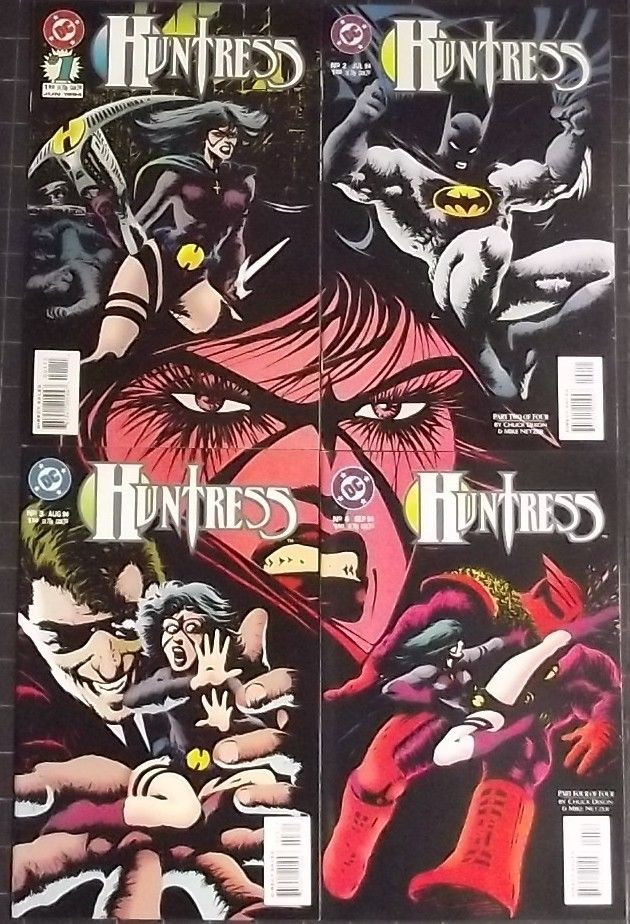
BONUS: I didn't notice this before, but the covers together form one big picture. Nice!


Overall, I highly recommend this mini for anyone who might enjoy a dark superhero-flavored  neo noir crime story.  The art is a bit "love it or hate it", but in my humble opinion, this is probably the best Huntress story I've read.

2019 CONCLUSION UPDATE

On a re-read of this series while scanning covers etc. for this "Rescue" of the original review, I still stand by my original humble opinion of this being probably the best Huntress story I've read.  

It's somewhat surprising to me that this story exists at all.  It takes a pretty mainstream character and drops her WAY down into the darkness of addiction to violence and PTSD, and THEN Chuck Dixon breaks the superhero mold and gives us an ending where nobody wins.  The Huntress in this series is a mental wreck, and even when she finally has the chance for her revenge, nothing changes. 

Yeah, Huntress is wearing a purple bikini.  Yeah, Batman makes a cameo.  Yeah, there's an armored supervillian.  But underneath the trappings of superhero comic expectations, there's a dark and gritty neo-noir organized crime story about revenge, betrayal, and the emptiness in the heart of a broken woman.

I acknowledged the 90's-Tastic Frank Miller-inspired artwork in the original review as being a bit "love it or hate it" in nature, but on a re-read I think that this series wouldn't have the same feel without it, and that the dark, strange artwork is the perfect compliment to the dark and brutal nature of the story. 

 One thing that I noticed on the re-read that I DIDN'T acknowledge in the original review is the fantastic coloring!  I really have to give credit to Pat Garrahy on colors.  Take a look at even the few pages I scanned above. . .the pops of color against the dark, heavy inks and backgrounds REALLY bring the art to life.

Overall, I found this short series to be a surprisingly good read.  The art may be a little hard on the eyes for those who prefer more "traditional" comic art, but I really enjoyed the unusual version of The Huntress presented here and find it a shame that DC didn't keep going with it.

Up Next. . .

More Longbox Junk!

With an advance apology for the inevitable summertime delays. . .

Be there or be square!

Tuesday, June 18, 2019

Longbox Junk - Oracle: The Cure

Welcome to another Longbox Junk Rescue Review!

These are older reviews I wrote under contract to a very popular (and still existing) comic site that shall not be named.  These days, they can be kindly described as a comic "related" site.  Most of these "Rescue Reviews" I've pulled from their hard to access and navigate archives.  THIS review is a little different in that it was a REJECTED review (for being too long and too negative), so it's basically pulled from my own archives.

This review has always sort of stuck with me because it was the beginning of the end of my writing comic reviews for pay.  To make a long story short, this review garnered me a rare phone call from one of the editors, who informed me that it was okay to write negative reviews about lower-tier publishers and fringe projects (such as First Wave), but in order for the site to keep getting exclusive previews and so on, going forward I needed to keep any reviews of "The Big Two" comics starring major characters positive. . .even with older material.

Needless to say, I didn't like being told to basically lie in order for the site to stay on the good side of comic publishers.  On the other hand, I WAS getting paid to read and write about comic books for a major comic site!  So I tossed this one in a hole and reluctantly toed the line for about another year until something else happened that  made me quit entirely.  But THAT'S another story!  

Enough about ME. Let's get into a bit of intro and background for the review at hand. . .

I really liked Oracle as a character. She was one of the more unusual mainstream comic characters out there. . .being a former superhero (Batgirl) that was paralyzed in a horrific attack by the Joker (in the classic Batman: The Killing Joke), but came to terms with her disability and became a behind-the-scenes information source, an incredible support for other heroes, and the leader of her own team (The Birds of Prey).

Oracle was a great representation of how being a hero doesn't necessarily mean wearing a costume and swinging from the rooftops, and was a great example to readers like my daughter of a powerful female character who didn't have to throw a single punch to be a complete bad@$$.

I won't get into it, for the sake of blowing this intro into something much longer than the review itself (and honestly, just thinking about it sort of makes me a little angry), but I feel that DC made a BIG mistake in taking such a great character as Oracle off their roster just to have Barbara Gordon being Batgirl again in the New 52.

BUT. . .

That doesn't have anything to do with this mini, which is pre-New 52.

It's a tie in to the "Battle For The Cowl" event, where the world thought Batman was dead after the events of the ironically-named "Final Crisis" and everyone was trying to figure out who was going to replace Batman, or if he even COULD be replaced or SHOULD be replaced.

THAT SAID. . .

Oddly enough, this mini has absolutely NOTHING to do with "Battle for The Cowl", and barely references it at all. It is ACTUALLY more of a follow up from Final Crisis itself, as the story picks up from events directly involving Final Crisis. . .namely, the Calculator's daughter being in the hospital on death's door and the Calculator trying to assemble a version of the "Anti-Life Equation" that was used by Darkseid in Final Crisis to save her.  

I'm not sure what the reasoning was behind having a Battle for The Cowl tie-in that's actually an epilogue to Final Crisis. . .an entirely different event. . .was, but I'm sure it's an interesting story.

ANYWAY. . .

What I'm trying to say is:  If you aren't familiar with the events of Final Crisis, then you will have a hard time understanding what is going on in this mini. The story directly references Final Crisis and it assumes you have knowledge of all the characters on deck. There is no real introduction to any of them and you are basically dumped right into the story. . .and it's not a very simple story.

In other words: Fair Warning. . .This mini is NOT for the casual comic reader. 

Let's do it!

ORIGINAL INTRO:

Welcome to a "Battle For The Cowl" tie in that's ACTUALLY a "Final Crisis" epilogue.

Wait. . .What?

On a re-read for this review, I have the same opinion as I originally did, so except for some pictures, the new intro, and a bit of spit shine, I've left the review pretty much as first written.

ORACLE: THE CURE
DC (2009)

SCRIPTS: Kevin Vanhook
PENCILS: Julian Lopez & Fernando Pasarin
COVERS: Guillem March

ISSUE 1
Home Again, Home Again


Holy Rack-oly! How about that cover?
It's nicely done and eye-catching to say the least, but I'm not sure it's entirely safe for work. . .

But that's the cover.  Let's look inside and see what we've got here. . .

Honestly, it's a bit of a mess. Not only because it's basically an epilogue to Final Crisis when it's advertised as being part of Battle for The Cowl, but because it's just sort of a mess. 

It tries to mix the virtual world and the real world so that a character who spends most of her heroic moments behind a keyboard can be seen in her element. Unfortunately, scenes of people sitting around tapping keyboards aren't awesome, so they have to find ways to get Oracle out and about.

They do that by showing her undressing for a shower. . .and having angry bo stick practice in her sports bra. . .and how about that cover again?  And those are just the "highlights".  They REALLY make an effort to sexualize Oracle in this series. It's a bit distracting and frankly a bit uncomfortable to see such a strong character reduced to PG-13 shower scenes.

Why, DC?

That aside, the lack of needed background to the convoluted story of the Calculator trying to save his daughter by assembling a version of the Anti-Life Equation online and testing it on computer hackers until he gets it right makes this comic EXTREMELY new reader unfriendly. 

It all just makes one wonder why this mini exists in the first place. The art isn't bad, the writing isn't bad, but it just seems like there's no real justification for the existence of this story.

Was there a demand for a Final Crisis epilogue for The Calculator?  And why do it in a Battle for The Cowl tie in?  For that matter. . .if this is a Battle for The Cowl tie in, then why is it barely referenced at all beyond a couple of throwaway lines while Barbara has dinner with her father, Commissioner Gordon?

All in all, this mini confuses me. I like it because I like Oracle, but is this the Oracle I like?

ISSUE 2
Big Trouble In Hong Kong

If you thought the cover to issue one was a "bit exploitative", the cover to issue two definitely borders on NSFW.

And once again, the overt sexualization of Oracle continues inside. Okay. . .I like to look at pictures of sexy women just like any other normal guy. That said, they seem to be going out of their way here. Within the first few pages, Oracle is assaulted and threatened with rape. Shortly after, her new hacker buddies are commenting on her nice wet shirt look. Then there's that cover. . .and so on and so forth.

 Barbara Gordon being sexy is okay.  It's okay to say that just because someone is in a wheelchair, that doesn't mean they can't still be attractive. But do we really need to be constantly hit on the head with it?

Oracle is supposed to be saving people from a virtual threat reaching out into the real world. . .Is how sexy she is really important to the story at all? It's really starting to look like fan service of the wrong kind.

ANYWAY. . .

The glaringly overt sexualization of the main character aside, this issue suffers from the same problems as the first. The main problem being that it's an epilogue to a different "event" than the one advertised on the cover and it isn't really explained what exactly the Calculator is trying to do, how he's trying to do it, or why he thinks it will work.

Short Version: He's making a virtual recreation of the Anti-Life Equation and testing it online on hackers he is luring before cutting crystals to the specification he discovers in order to re-create the Equation in the real world.

It doesn't help that the story is very convoluted and it's never really explained how the Calculator can reach out from the internet to kill people in the real world.

Just. . .reasons?

The writing and art are still good. . .an interesting paradox. . .how can the separate parts be good, but the combination be bad? Of note is a fantastic double page spread of Oracle's avatar moving through the virtual lattice framework of the internet. It's just an awesome piece of art! 


Now THAT'S the Oracle I want to see more of. Not Barbara Gordon laying in a Hong Kong Alley being threatened by leering would-be rapists.  I'm glad that Oracle finally got a solo series, but the character deserves better than this.

AND FINALLY. . .

ISSUE 3
A Matter of Anti-Life or Death


The good news is they toned down the cover a bit from "borderline NSFW". 
The bad news is that they toned it down to "Busty pulp damsel in distress".

Thank God this mini was only 3 issues. The ending is basically a "to be continued" setup for further events in the DCU, and the journey through the rest of the issue to get to that weak ending is a hot mess.

Oracle confronts the Calculator in cyberspace and defeats him. . .then confronts him in the real world and it's shown that the effects of their avatars battling on the internet has affected the Calculator in real life. How? Nobody knows! Anti-Life Equation. . .reasons!

The ending was a real downer. No happy ending here. Calculator was just trying to help his daughter. He ends up in prison. His daughter ends up paralyzed. Oracle has this mini hanging around her neck like a sexy albatross. Calculator doesn't win.  Oracle doesn't win. The reader doesn't win.

Nobody wins.

Okay, okay. . .it wasn't ALL bad. 

They toned down the sexualization in this issue and showed Oracle as a hero fighting in her own element. The characterization was better this time around.  Oracle is depicted as a hero on her own terms. No Birds of Prey. . .no Bat-Family. I also liked that it touched in several places on the events of "Killing Joke", where she was shot and paralyzed years before, giving some nice continuity.

CONCLUSION

A convoluted story, awkward sexualization of Oracle, a downer ending based on unexplained powers suddenly showing up, and a basic lack of justification for the existence of this mini at all overshadow the few good points present.

I wouldn't really suggest this mini to anybody new to comics or new to the character of Oracle as any sort of introduction. It's definitely "in-crowd" only on this one.  For that matter, I won't even recommend it for the "in-crowd".

At the end of it all, it's just a confusing mess that really shouldn't exist.  For a fan of Oracle such as myself, it's a wasted opportunity for a great character and a damn shame.

Next up. . .

Travel with me back to 1994 and remember the wonderful world of anger, crossbows, and clenched teeth that USED to be The Huntress when she was DC's answer to The Punisher! DC's The Huntress 4 issue mini.

 Be there or be square!