Showing posts with label Zenescope. Show all posts

Monday, October 17, 2022

Longbox Junk Halloween Horror 2022 Part 9 - Grimm Tales of Terror (vol 2) #9

Welcome to Longbox Junk, where I write comic book reviews nobody asked for!

If the house is rockin' don't bother knockin'!  The Longbox Junk Halloween Horror 2022 party is still going on, and you're invited!  It's that time of year when I pack this blog FULL of spooky comic book fun, so let's get to it!

Okay. . .

I've reviewed a few Zenescope comics and haven't been very impressed.  In response, I've gotten several private messages from readers (after my recent review of the 2019 Halloween Special) telling me that I'm being a bit unfair by coming into the reviews with some preconceived notions.  

But to BE fair, those preconceived notions of Zenescope in general being a comic company in the business of selling sexy comic COVERS without much effort going to the pages in between have borne the bitter fruit of truth once I actually dig into the comics.  Sometimes the truth sucks.  I'm not going to try and sugar coat a rotten apple.

THAT SAID. . .

I'm going to give Zenescope another chance.  The same readers who gently chastised me for coming into the reviews with preconceived notions have informed me that the 13 issue 2015 - 2016 Grimm Tales of Terror Volume upped the quality of writing and art to something I might appreciate a bit more.

With that in mind, I stopped at the comic shop Wednesday to get my pull and decided to check the back issue bins for some of that Grimm Tales of Terror volume.  The comic at hand is the only one they had. It cost me 5 bucks, so I had grit my teeth through the ordeal of paying cover price for a comic from 2016, but I somehow managed to survive.  The things I do for my Longbox Junk readers!

Ready? Let's do it!

GRIMM TALES OF TERROR #9
Zenoscope (2016)


COVER: Eric J

THE COVER:

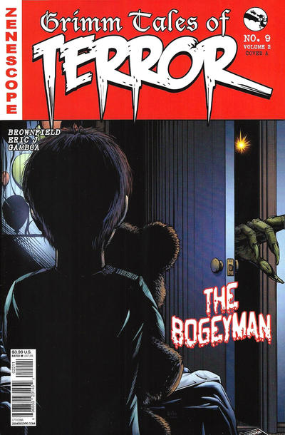
Wait. What? *checks cover* Yep. . .this IS a Zenescope comic.  But where's the sexy?  This comic has 3 covers, and only ONE of them has a sexy girl on it?  Unheard of! Harrumph!  *adjusts monocle*

ANYWAY. . .I like it!  It's not the greatest comic cover I've ever seen, but it's nicely drawn, and I'd definitely hang this one on the rotating "Wall O' Covers".  The title takes up a lot of space that could be used for art, but other than that this is a nice, spooky Halloween cover.  It has a creepy vibe to it that makes me want to get inside and see what this story is about.  So, let's do that!

THE BOGEYMAN

SCRIPT:  Joe Brusha, Ralph Tedesco & Troy Brownfield
PENCILS: Eric J
INKS: Eric J

THE STORY:

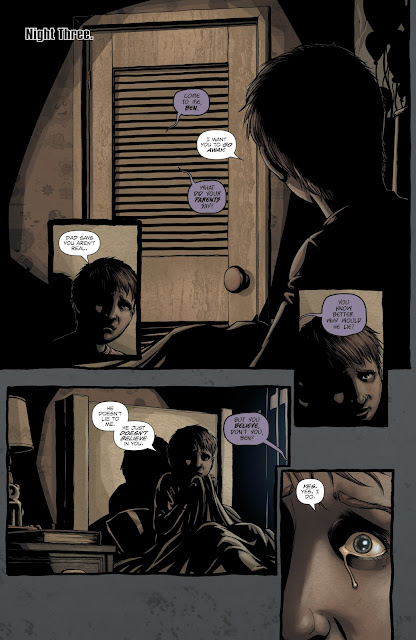
When young Ben begins constantly waking up screaming in the night, his parents are concerned but frustrated.  They think Ben just needs attention, but he knows better.  A voice talks to him from the closet, taunting him and tormenting him. . .


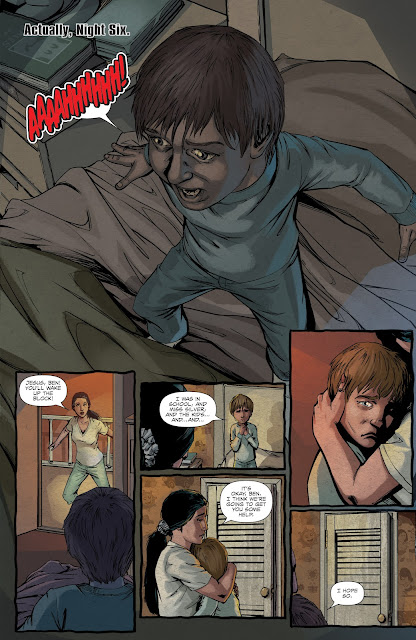
As the nights go on, Ben is tortured by horrific dreams of blood and death.  As he wakes screaming, the voice continues to taunt him.  Finally, his parents decide he needs professional help. . .


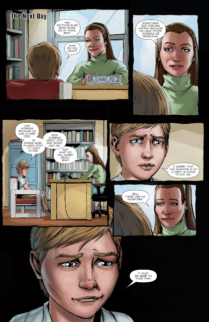
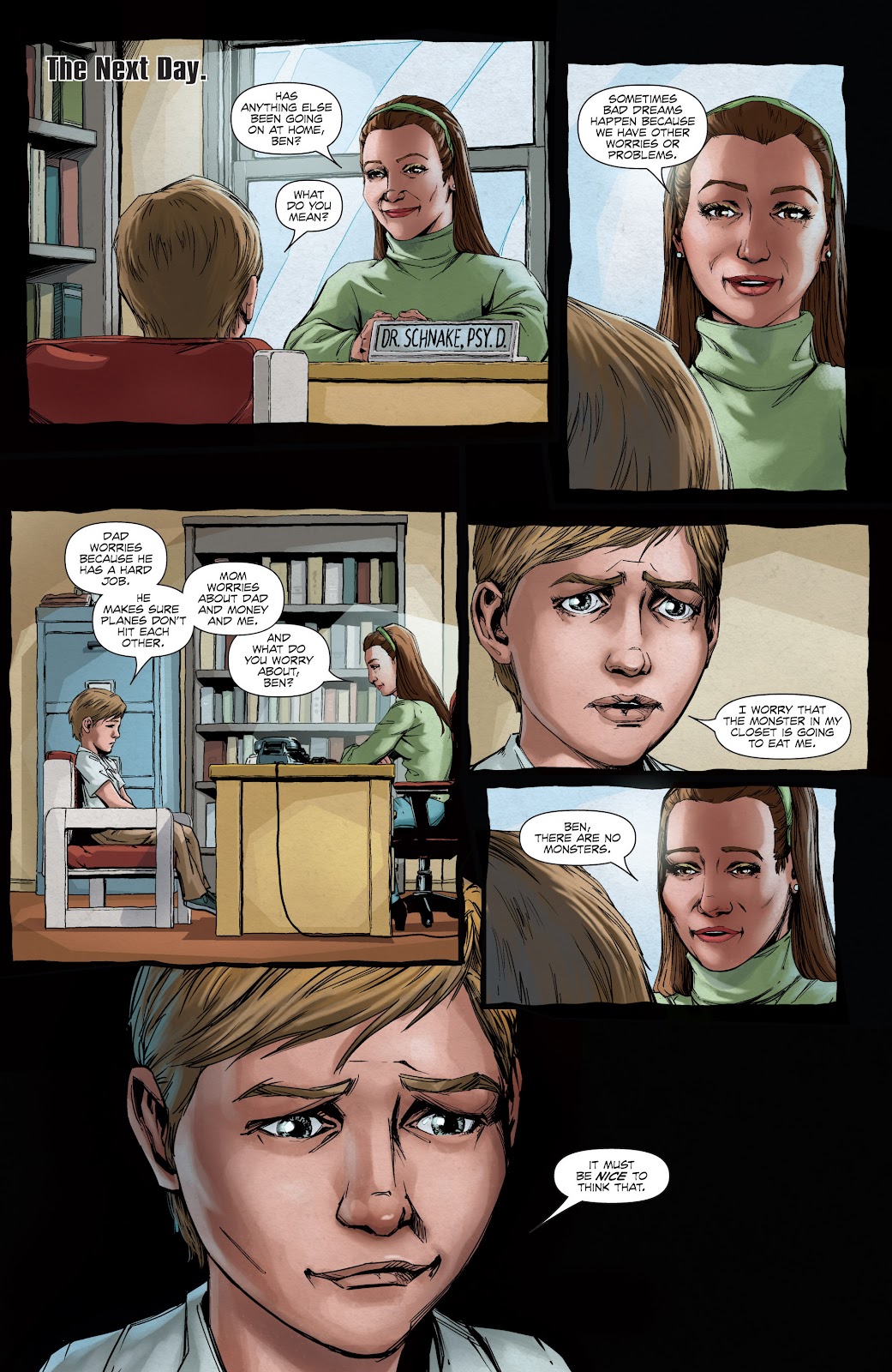
The child therapist tries to help Ben, but he knows the truth. . .there IS something in his closet that wants him to do something terrible. The adults don't understand and don't believe him.


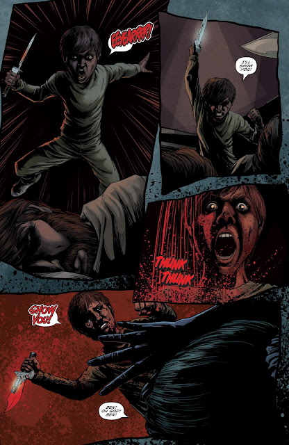
Finally, it gets to be too much.  The constant whispering of the voice from the closet, the bloody nightmares, his parents refusing to believe him.  Ben finally breaks and, at the urging of the voice from the closet, attacks them with a knife in their sleep, brutally killing them both!


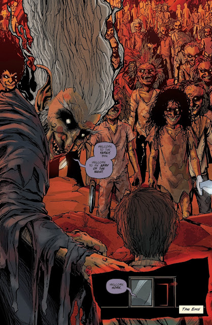
After the bloody deed is done, the voice from the closet finally reveals itself. . .a twisted, ancient creature that beckons Ben to join it.  As Ben follows the creature into the closet, he sees an army of twisted monster children inside.  He has become one of them.


The End.

THE REVIEW:

Okay then.  There it is.  Grimm Tales of Terror #9. . .The Bogeyman.  Let's break it on down!

I liked it!  It's an extremely simple story, but it's well-written and hooked me in until the last page.  This little story of a boy being tortured into slaughtering his parents by a mysterious voice from the closet taps into a creepy place that makes it memorable and engaging despite being extremely straightforward.  This story starts out on an inevitable path and travels to the end without a bit of deviation.  Is it the best horror story I've ever read? Not even close.  But it IS a good one.

On the art side of things, as promised by my readers, this is some of the best art I've seen in a Zenescope book yet.  Like the writing, it's not the BEST art I've ever seen, but it's pretty darn good.  It gives the story a dark and creepy feel, with effective use of dark shadows and bold lines.  It falls apart a bit during the scenes set in daylight, but this is a story about things that whisper in the night, so of course there's more of a focus on those scenes.

CONCLUSION

Overall, I liked this one quite a bit.  I say "thanks" to the readers who pointed me in this direction, because they were right.  Zenescope CAN do comics without crappy art and stories that seem like thoughtless filler to pad the space under a sexy cover.  This one was actually pretty good.

Is it the best comic book horror story I've read?  I've read better. . .but this IS a simple, creepy exploration of the Bogeyman in the closet trope, backed up by some good art that really drives home the dark and shadowy motif of the tale.

I feel I can safely recommend this little one-shot horror story to any fan of horror comics reading this.  I'm not sure about the rest of the series, but I know I'm going to keep my eye out for more issues so I can find out!

For once, Zenescope is a Longbox Junk winner!

Up Next. . .

This party ain't over yet!  MORE Longbox Junk Halloween Horror fun is on the way!

Be there or be square.  


Thursday, October 6, 2022

Longbox Junk Halloween Horror 2022 Part 4 - Grimm Tales of Terror Halloween Special 2019

Welcome to Longbox Junk, where the comics are cheap and the reviews are free!

The Longbox Junk Halloween Horror 2022 party has just started, so let's keep it going!  

This time out, the comic at hand is a horror anthology special from a publisher that has definitely carved out a niche in the "sexy cover" category of comics.  Zenescope has the sort of covers that MIGHT get you a strange look from your wife if she sees you buying one.  Talking from personal experience here.  

But what's under that cheesecake cover?  Is it worth your time and hard-earned cash?

Let's take a look and find out!

GRIMM TALES OF TERROR
HALLOWEEN SPECIAL 2019
Zenescope (2019)


COVER: Igor Vitorino

THE COVER:

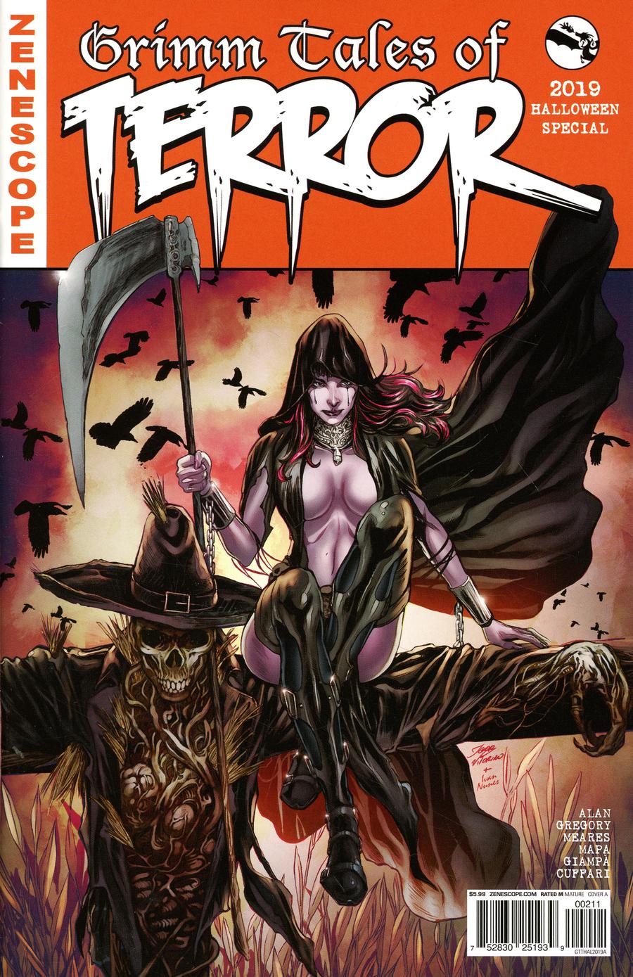
Yep.  That's a Zenscope cover. Looking at the variants for this issue, I see that I actually have the tamest of the bunch!  Honestly, I like it.  It could stand to tone the sexy down a bit, but I guess if it ain't broke, don't fix it. Zenescope knows their lane and keeps in it.  It's nicely detailed, I like the muted colors a lot, and the scarecrow is actually pretty creepy.  Not a bad cover. . .just not one to hang on the office wall.

THE STORIES:

Three stories in this one, all tied together with a framing story thread about Keres, (Zenescope's Goddess of Death), setting up a costume shop in a college town in order to bring punishment to those worthy of it running through the issue.

Let's take a look at each story in turn. . .

EVIL TATTOOS

SCRIPT: R. Alan
PENCILS: Butch Mapa
INKS: Butch Mapa

A bullied kid finally gets his revenge on his tormentors thanks to magical rub-on tattoos given to him by a woman at a mysterious costume shop that turn the bullies into twisted monsters.


THE REVIEW:

Not a great start.  This first story is so light that it's almost not even there.  From the title to the extremely basic artwork, this reeks of minimum effort.  Hopefully, things will get better from here.

MOVING ALONG!

CAT AND MOUSE

SCRIPT: Raven Gregory
PENCILS: Umberto Giampa
INKS: Unberto Giampa

At a frat house Halloween party, a would-be predator finds himself being the prey when strange decorations bought at a mysterious costume shop summon an ancient vampiric demon in the form of a beautiful woman.


THE REVIEW:

*sigh*

Another extremely light story that seems to be more of an excuse to feature a scantily-clad woman through about half of the panels than anything else.  At least the art on this one is much better than the first story.  That's about the only thing to like here.

I'm not holding out high hopes for the last tale, but let's check it out!

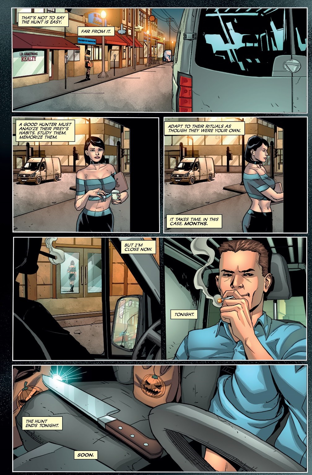
THE HUNTER

SCRIPT: Ben Meares
PENCILS: Salvatori Cuffari
INKS: Salvatori Cuffari

A beautiful woman turns the tables on the stalker hunting her when she reveals that she was, in fact, hunting him the whole time.


THE REVIEW:

This is the second tale in this issue to follow the well-worn "Hunter becomes the prey" story path.  This one actually pulls it off much better in the writing department, but takes a step back with the art.  Although I DID like that the reader doesn't really know which point of view the story is being told from page to page, this is still a pretty forgettable effort.

CONCLUSION

Overall, this was a pretty weak excuse for a horror comic.  There is a definite feeling through the whole thing that it's just a minimal effort excuse to put pages between the sexy cover that Zenescope was counting on being the selling point.  

To be honest, nothing here was BAD, but nothing was really that good, either.  The art in the second story and the writing in the third manage to reach the bar of "pretty good", but there's no effort to go any higher than that.

I think it's safe to say that most horror comic fans can go ahead and skip this one unless you happen to be a fan of sexy comic book covers (and there's nothing wrong with that).  There's really not much here to like.  I found this in a dollar box and that's right where it belongs.

Up Next. . .

That's right! MORE Longbox Junk Halloween Horror fun!

Be there or be square.

Sunday, October 24, 2021

Longbox Junk Halloween - Conspiracy: Area 51

Welcome to the 2021 Longbox Junk Halloween Horror Party!

Ah. . .Halloween.  I love it!

It's that one special time of year when Wal-Mart shamelessly displays "Naughty Nurse" outfits that would usually only be found in somewhat sketchy stores on the outskirts of town. . .and one aisle over it's a winter wonderland of  pre-lit plastic Christmas trees in every color of the rainbow!

To which I can only quote Will 'Wicky, Wicky, Wild Wild West' Smith and say: "Welcome to Earth!"

And on THAT note, let's get some aliens in here!

SPOILER ALERT! This series has been completed, but it's still pretty new, so I'm going to keep the spoilers to a minimum, if you want NO spoilers, just scroll on down to the "Conclusion" for my spoiler-free opinion.  END SPOILER ALERT!

CONSPIRACY: AREA 51
Zenescope Entertainment (2020)

SCRIPT: Joe Brusha, Ralph Tedesco, Dave Franchini, Hans Rodionoff, Adam Goldberg
PENCILS: Allan Otero
COVER: Leonardo Colapietro

THE COVER:

I like it!  It's creepy, nicely painted, and the colors are vaguely unsettling.  It makes me want to buy this comic and see what the story is about. Certainly not what I would expect from Zenescope, who have carved out a niche as the company with 20 variant covers for every issue they put out, each with a different scantily-clad woman on it.  I didn't even realize this WAS a Zenescope comic until I started writing this review!  Extra points for that.  Let's get inside!

THE STORY:

In the aftermath of the failed "Storm Area 51" viral Facebook event of 2019, three friends manage to obtain high level clearance badges to access the secret base through an army friend who works as one of the gate guards.

As the three infiltrate Area 51 using their assumed identities and stolen access badges, they are at first amazed to discover a hanger full of extraterrestrial spacecraft, and then horrified as they delve deeper and find scientists dissecting live humans in a secret laboratory and tanks with what appear to be growing clones inside.

As they try to escape the base, they find and free a man being held prisoner in a medical wing of the laboratory, as the confused man runs for his life, the three friends are gunned down by Area 51 guards.

As the three friends are killed, the man they freed makes his way to an office and manages to get a call through to his house, where a man answers the phone and informs the escaped prisoner that he can't be who he says he is because that's who is speaking.  As the terrified and confused prisoner listens to himself on the phone, he too is killed by an Area 51 guard.

The End. . .To be continued.

THE REVIEW:

A pretty good story!  Lots of potential here, and it makes me really want to hunt down the rest of the issues (5 issues in a regular series and 5 connected one-shots like this one) to get the whole story.

But I'll tell you what I REALLY like about this one.  As I mentioned in my look at the cover above, I didn't even realize this was a Zenescope comic until I sat down to write this review. . .and that's a GOOD thing!  

I've never been very impressed with Zenescope as a publisher.  They seem to have carved out a niche for themselves (a pretty successful one, from what I've seen) as the company with comics about sexy girls.  They're the sort of comics that give comics a bad name, and not really the sort of thing you want to admit you're a fan of.  I've never reviewed a Zenescope comic that I've liked yet.  They just seem to reach down to the lowest common young male denominator.  

BUT. . .

This is a well-written story that hooked me in and made me want more. . .with nary a T or A to be found!  I would have never thought I'd read a Zenoscope comic that didn't deal in their usual puerile stock in trade, or that I would actually enjoy it so much!  Is Zenescope beginning to grow up a little and step outside the profitable box they created for themselves?  That remains to be seen, but THIS is a pretty decent little story!

As far as the art goes, it's serviceable.  It tells the story, but doesn't try much harder than that.  Pretty much par for the course with Zenescope.  An eye candy cover with minimum effort inside.  The art isn't BAD. . .it just doesn't try that hard to be anything more than "pretty good".


CONCLUSION

Conspiracy: Area 51 is a creepy story that makes me want to read more.  It blends in conspiracy theory, current events, and mind-bending twists into a narrative that is sure to please anyone interested in possible Government/ Extraterrestrial connections.  The art is serviceable, but not bad.  It tells the story, but doesn't try to go above and beyond that minimum requirement.

Perhaps the BEST thing about this comic is that it's a Zenescope comic that you can actually read without hiding the cover.  Hopefully this is a trend that Zenescope will continue to follow!

Up Next. . .

Keepin' the Longbox Junk Halloween Party going with a trip back to 19th Century New York City and the spooky tale of a young woman beset by paranormal forces!  It's DC/Black Label's "Daphne Byrne" #1.

Be there or be square!

Monday, February 24, 2020

Longbox Junk - One Shots (part 2)

Welcome to Longbox Junk, the place to find all the comic reviews you never asked for!

Join me as I continue to go through a hefty handful of random one shot comics from my collection. In the first part, I was pleasantly surprised to find not a bad one in the bunch. Sure, there were little gripes here and there, but overall I couldn't find much wrong with any of them.

Will my lucky run of winners continue? Let's find out!

ONE SHOTS
(Part 2)

OUR ARMY AT WAR 
DC (2010)


TIME STANDS STILL FOR NO MAN
SCRIPT: Mike Marts
PENCILS: Victor Ibanez
COVER: Joe Kubert


Sergeant Rock is one of my favorite characters. As a Marine Corps veteran, I can appreciate how Rock is actually one of the greatest ANTI war characters ever created. This modern take on Rock is one of the strongest comics I've read in a LONG time.

It is written to perfection with the story flashing back and forth between WWII and present-day Afghanistan, with the characters finishing each other's dialogue across time, showing the old soldier's adage "The more things change, the more they stay the same." to be true.

The ending of the story, when we find out why the modern character joined the military, is an emotional punch to the gut, and comes out of nowhere. I won't spoil it, but it's the kind of ending that puts everything before it in a whole new perspective. . .

The art is superb in every way, from the Japanese attack on Pearl Harbor, to the 9/11 attack on the Twin Towers, the whole issue is rendered in incredible detail. And then there's that fantastic cover by the legendary Joe Kubert!


From the cover to the last page, this one shot delivers on every single panel!
Highly recommended for any fan of military comics.

We're off to a great start. . .let's see what's next!

GIANT-SIZE WOLVERINE
MARVEL (Vol. 3, 2006)

COVER: DAVID AJA

This is a nice, hefty book. I like the heavy feel of it in the hand.
Unfortunately, 75% of it is reprint material (X-Men vol 2 #6-7). Let's look at the parts separately. . .

HOUSE OF BLOOD AND SORROW
SCRIPT: David Lapham
PENCILS: David Aja


I'm not the biggest Wolverine fan, but I REALLY liked this story! Wolverine stumbles upon strange goings-on when he crash lands on an isolated farm outside of a small, superstitious town.

The dark and twisted art by Aja perfectly suits the "Backwoods Cthulhu" horror of this story, and the colors in sickly shades of brown and green really bring it home.
This is now officially one of my favorite Wolverine stories!
It's gruesome Lovecraftian horror with Wolverine in "Logan" mode. A real hidden gem!

X-MEN (vol 2, 1992) #6-7
FURTHER STILL / INSIDE? OUT!
SCRIPT: Jim Lee & Scott Lobdell
PENCILS: Jim Lee


Where the first part of this one shot was dark, moody, and horrific, the back 3/4 of the book is brightly-colored 90's superhero cliche to the hilt, with a giant cast of characters shouting exposition to each other.

I found it a bit hard to get through, and didn't really understand most of what was going on as it just sort of drops you into the middle of the continuity-dense X-Men saga. I don't understand the thinking behind including these reprinted issues. It's a complete disconnect from the first story in both tone and appearance.

The Jim Lee art is fine, in his signature 90's-Tastic way, so the reprint isn't entirely bad. It's just totally out of place. It feels like padding to justify doubling up on the price. I'm sure they could have found an older solo Wolverine story that would have fit better to reprint here. This just feels lazy.
All in all, this one shot was half and half. A dark Wolverine story that is superb in every way, and a gaudy, wordy, 90's X-Men reprint. If it was JUST the first story, this would be a total winner. But as it stands, I'll just recommend this one for the first story.

NEXT!

STAR WARS
ANNUAL #1
MARVEL (Vol. 4, 2015)


SCRIPT: Kieron Gillen
PENCILS: Angel Unzueta
COVER: John Cassaday

I really liked this story, which sits apart from the regular Star Wars continuity as a stand-alone tale.

It tells the story of a Rebel Spy who has been undercover in the Imperial bureaucracy on Coruscant for many years until he becomes involved in a desperate operation to save Imperial Senators sympathetic to the Rebel cause from the Emperor's wrath. . .not knowing he's been lured into a deadly trap.


While the art is generally good, and even has a few really great moments (the awesome opening page shot above of Imperial Coruscant comes to mind), what elevates this story is that it completely flips the script and defies expectation in that not only is the hero unsuccessful in his mission, but he is played like such a chump by The Emperor, that his mistakes are devastating to the Rebellion.

I know, I know. . .the heroes are supposed to win against the odds. But there's a reason that Empire Strikes Back is regarded as the best Star Wars movie. The writer of this One Shot remembered why that is. . .Sometimes the bad guys win too. Very nicely done. Highly suggested for any Star Wars fan!

MOVING ALONG!

WONDER WOMAN
ANNUAL #6 
DC (vol. 2, 1997)

COVER: David Beekman

There for a while, DC was doing "themed" annuals. . .Year One, Elseworlds, etc.

This one was from one of the more forgettable years. "Pulp Heroes". To tell the truth, I see very little "Pulp" in this annual (compared to some of the others) and more "Two pretty standard stand-alone Wonder Woman stories" Let's look at them separately. . .

NECROPOLIS
SCRIPT: John Byrne
PENCILS: John Byrne & Tom Palmer


The first story is a tale of Wonder Woman as a young teenager on Themyscira discovering death and madness in Paradise as she accidentally causes the death of a friend, then descends to the "City of The Dead" to try and rescue her.
The story was a bit light, but interesting, and is backed up by some great Bronze Age throwback artwork. I did like that they decided to set the story in Wonder Woman's past, and that the villain was unexpectedly sympathetic. All in all, a pretty good story.

FROM HELL SHE CAME
SCRIPT: Joan Weis
PENCILS: Ed Benes

The second story features Artemis (AKA Angry 90's Substitute Wonder Woman) going to Hades to lead a failed rebellion, then tricking Hades in order to escape again.

This one was full on 90's style "Bad Girl" violent cheesecake. The story was light and tacked on as an excuse for the fighting. The twist at the end was predictable. Ed Benes delivers a full-on 90's-Tastic artgasm that any fan of Jim Lee would be proud of. But at the end of the day. . .taken as a relic of the 90's, it's not too bad. It's one of those "So bad, it's sorta good" things. 

Both stories taken together, this was a decent one shot. Nothing great, but not particularly bad. It's just a little odd that neither story fit the "Pulp Heroes' theme at all, especially when compared to other Annuals in the theme that year. So as pulp it fails. As a couple of decent Wonder Woman stories, it does okay.

AND FINALLY. . .

GRIMM FAIRY TALES
THE LITTLE MERMAID 
ZENESCOPE (2009)


SCRIPT: Raven Gregory, Linda Ly, Ralph Tedesco & Joe Tyler
PENCILS: Claudio Sepulveda
COVER: David Nakayama

I knew my luck couldn't last. This one was pretty bad.

First, the good. . .the cover is awesome!

And that's about it.

The hefty one shot is a collected reprint story from the main "Grimm Fairy Tales" series (#25-26), and is a "Be careful what you wish for" tale set in two different intertwining times and places. . .a medieval fantasy kingdom and modern times.

The story itself is. . .okay. It's predictable and extremely light, but it's okay. Too bad that "okay" is where they got it to when there are FOUR(!) credited writers. I'm not sure there's an excuse for that.

The worst problem here is the extremely weak and juvenile art. It looks like something a high school student would draw to impress his friends. Everything looks sketchy and unfinished. Faces and hands are crude afterthoughts. The artist has a real problem with vehicles and backgrounds. The only thing he draws well are close up shots of female bodies. Anything past middle distance is pretty vague.


All in all, this is a borderline average story backed up with some pretty awful art. The whole thing reeks of cash grab. Like I said at the start, the only good thing about this one is the cover.

CONCLUSION

It's a bit more of a mixed bag for this handful of one shots, compared to the first. There were two outstanding examples of creative teams stepping up to the plate and hitting a one shot home run in Our Army at War and Star Wars Annual #1. . .both highly recommended if you should spot them in a back issue bin. 

 Wolverine had an excellent opening story backed up by a strange choice of reprints. Wonder Woman was pretty good. Not bad, but not great. Little Mermaid definitely stands out as the foul ball of this bunch with a weak story that took four people to write and art that's barely professional.

Up Next. . .

Let's step away from the one shots and take a look at a Batman/ Superman mini-series without Batman or Superman! Well. . .unless you count the giant Kryptonite-powered Batman/Superman robot that Gotham's substitute superheroes punch into submission at the end of things. . .BUT I'M GETTING AHEAD OF MYSELF!

It's DC's 2009 "World's Finest" mini.

Be there or be square!
Monday, November 25, 2019

Longbox Junk - Off Brand One Shots Part 1

Welcome back to Longbox Junk, the place to find all the comic reviews you never asked for!

I believe I've mentioned in a couple of posts that I've recently come into two longboxes STUFFED with non-DC/ Marvel comics. . .mostly from the 90's.

I bought the boxes from a closing comic shop (another one bites the dust, R.I.P.) for a measly FORTY BUCKS because the shop owner knew that nobody else but me was going to touch them.  Indeed. . .his closing sale had been going on for a week and he hadn't sold but a few comics from those boxes.

SO. . .

Here I sit with about SIX HUNDRED random comics from mostly-defunct comic publishers like Valiant, Malibu, Innovation, Eclipse, NOW, Impact, Continuity, Topps, CrossGen Chaos, and others I've never even heard of.  Along with a healthy sprinkle of older comics from companies that are still chugging along like Dark Horse, Image, and Antarctic.

What to do with all of that fine Longbox Junk? Unfortunately, there isn't much that's complete, as far as runs or mini's. . .so despite the bounty of bargain box books at hand, they don't really fit my concept for Longbox Junk, where I generally try to get into full runs and complete stories.

BUT. . .

Among all the incomplete runs and story fragments, there is a big, beautiful stack of ONE SHOTS!

If you've been reading this blog for a while, then you know the love I have for the one shot!  It's probably my favorite form of comic art.  The creative team has ONE and ONLY ONE issue to tell a complete story.  There's no room for error. . .no "well, maybe next issue will be better", like there is in a series.  I absolutely love seeing if a creative team can step up to the challenge of the one shot.

So let's get into some of these non-DC/Marvel one shots, shall we?  We shall!

RED SONJA
A DEATH IN SCARLET
Cross Plains Comics (1999)

A DEATH IN SCARLET
SCRIPT: Roy Thomas & Steve Lightle
PENCILS: Steve Lightle
COVER: Steve Lightle

THE COVER: 
Very nicely done! Lots of detail, great colors.  I like the way the main subject sits against the stark black background.  Sonja's face is a little strange, and there's no way I can hang this one on my office wall without an awkward appointment with HR (but that's Red Sonja covers in general, not just this one), but I like this one a lot!

THE STORY: 
A young Sonja learns the trade of thievery from a woman named T'Shika in the city of Khorsun.  When a theft goes wrong and the two find themselves pursued by the private army of a rich trader, Sonja stumbles into knowledge that the trader had something to do with the death of her family.

Sonja turns from hunted into hunter as she and T'Shika infiltrate his palace and find an ally in the form of an enslaved shape-shifting priestess called Sabra.  Unfortunately, in the battle to get close to the trader and gain information, Sonja accidentally kills him and is forced to leave without getting any closer to those who killed her family.

The End?

THE REVIEW:
  Although listed as a one-shot on comic reference sites, this comic looks a lot more like what was supposed to be the first issue of an ongoing series.  It stands alone as a pretty good story, but there are a lot of obviously-dangling plot threads, including an ending that's more of a "to be continued".  That said, the legendary Roy Thomas does a great job returning to one of his signature characters.

BONUS: There's a nice little essay in the back by Thomas on how he created Red Sonja for Marvel.


The art is very nicely detailed, but the colors are often a little garish.  Not often enough to bring things down too much, though.  There's also a LOT of cheesecake going on.  Like the cover (same as the interior artist), there's a pretty hard focus on Sonja in sexy poses throughout the whole comic.  So even though the story is pretty good, this isn't really a comic you're going to want to read at work.

THE VERDICT: 
I give this comic 4 out of 5 barely-covered boobs.

NEXT!

BOMBAST
TOPPS (1993)

BOMBAST LIVES!
SCRIPT: Roy Thomas & Gary Friedrich
PENCILS: Dick Ayers & John Severin
COVER: Jack Kirby

THE COVER: 
A great, colorful, old school character cover by the legendary Jack Kirby. . .complete with the signature Kirby Krackle! To be honest, the character himself looks a bit generic.  That said, this is the kind of cover that makes you want to see what's inside.  I REALLY like the bombastic text advertising the all-star classic creative lineup and the hilarious (to me, anyway) "1 of 1 COLLECT 'EM ALL!" tag.

THE STORY: 
A strange earthquake rocks the city of Chicago, opening a deep chasm that a young street punk named Darren falls into.  He finds himself in a mysterious cave with glowing rocks and a strangely-dressed man in a crystal pod.  As he investigates, he accidentally opens the pod and frees the man, who speaks in a strange language. . .but we readers know that he's a "ninth man" named Bombast with a mission to save the world of the "tenth men" and he's been in the pod for 15,000 years!

The confused Bombast leaves the chasm with Darren and begins to explore the unfamiliar world of technology he's found himself in.  When Darren is attacked by drug dealers he owes money to, Bombast saves him by using superhuman powers that allow him to turn almost anything into a deadly thrown weapon.  The battle brings Bombast to the attention of Chicago's resident super-cop, The Savage Dragon!

Bombast realizes he can't defeat Savage Dragon and is forced to escape.  Soon after, he encounters a strange metal-clad being named Death Flash who speaks his language.  Death Flash reveals that he is also a ninth man, but he is there to destroy humanity.  After a short battle, Bombast returns to the chasm, hoping to find some information to guide him.  He encounters yet another ninth man called Glida.  As they battle, their fight is interrupted by ANOTHER ninth man named Captain Glory, who somehow knows both of their names.

The End. . .to be continued.

THE REVIEW:  
There's a LOT of old school talent on this book!  That said. . .the finished product sadly doesn't  match the promise held in those names.   It's a shame to see such a waste.  The story is actually pretty poorly-written. . .especially in the dialogue, and in particular the dialogue of the reader's entryway into the story, the young, black "junkie" who discovers Bombast.  To be perfectly honest, most of his dialogue is extremely cringeworthy and borderline racist.  It almost breaks the story, it's so bad.

Setting that aside, the character of Bombast himself is just as generic as I was afraid of based on his cover appearance.  His powers are vaguely defined (he can. . .throw stuff?), he looks pretty ridiculous, and his dialogue is slightly annoying.  To make matters worse, his foe "Death Flash" rolls around Chicago on roller skates.

I realize that the creative team were going for a sort of late Silver/ early Bronze Age throwback style, and to their credit, they succeeded. For a comic written in 1993, this looks and feels exactly like something from the early 70's!

Unfortunately they didn't succeed in a GOOD way.  Instead, this is the sort of cringeworthy stuff that people making fun of the Silver/Bronze Age point and laugh at.  Maybe it was done on purpose? I sort of hope so, because then it's kind of brilliant, in a way.  If not, then it's just a pretty poor effort.  Sadly, I have the feeling this wasn't SUPPOSED to be bad.


The art serves the purpose of telling the story, but doesn't try to reach any higher than that.  Like the writing, I was expecting a little more from names like Ayers and Severin.  This whole comic just sort of feels like the minimum effort was put into it.

BONUS DISAPPOINTMENT: My copy didn't even have the Super Deluxe KirbyChrome trading card.  A single tear slowly trickles down my cheek. . .

THE VERDICT: 
I give this comic 2 out of 5 old white guys trying to figure out how young black people talk.

NEXT!

GRIMM FAIRY TALES
2017 ARMED FORCES EDITION
ZENESCOPE (2017)

BLOODLINE
SCRIPT: Joe Brusha & Dave Franchini
PENCILS: Ario Murti
COVER: Alfredo Reyes

THE COVER: 
As a former Marine, a red-blooded male, and a general "America, Hell Yeah!" kind of guy, this cover immediately grabs me.  It's bold and very nicely done.  If I could hang this on my office wall without multiple HR complaints, I would.

BUT. . .

As an adult comic reader, it's a little embarrassing.  I would never have bought this if it hadn't come to me in a giant box of random comics.  My daughter was laughing when we were pulling one shots to the side in a separate pile (there's about 30 more) and she spotted this one.  She asked who buys these kinds of comics.  I didn't have a good answer.  That's why it's in this review.

THE STORY:
In the dead of night at the National Museum of American History in Washington, D.C., a mysterious hooded woman tracks her prey through the dark halls of the museum, pausing to briefly reflect on her family's long and dedicated military service to the United States through history as she passes by various displays.

Finally, she confronts a giant bull-headed creature with glowing red eyes and leaps into action, revealing herself as Belle, Hunter of Beasts! And. . .nope. That's it.

To be continued.

THE REVIEW:
What little "story" there is in this comic takes up a total of three and a half pages, and is actually just a preview for a (then) upcoming series.  For what it is, it's well-written and nicely-illustrated, but it's hardly worth even calling a story.

So this is a pretty thick comic.  What's in the rest of the pages?

It's all single page pinups of scantily-clad women with barely-there "military" wear and guns.  So, yeah. . .except for the preview at the front, the rest of this comic is boob-tastic military soft porn.


Now, don't get me wrong.  The art is great on all of them, and I've got nothing against some fine-lookin' comic ladies. . .but it's just sort of embarrassing that comics like this exist.  It reminds me of the old "Swimsuit Specials" Marvel used to put out before they realized everyone was making fun of them for it.  And indeed, my daughter was laughing when she challenged me to review this.

Challenge accepted, punk! BOOM! Here's your review!

BUT I DIGRESS. . .

Talking about the cover above, I mentioned that my daughter and I were pondering who exactly buys these comics.  Who are they created for?  The only answer I really can think of is that there's a LOT of fantastic artistic talent being wasted appealing to the most basic interests of young men, and that (based on the other handful of comics from this publisher I now own) Zenescope as a company in general exists to profit from those basic interests.  Those basic interests being boobs.

Seriously. . .there's some great talent in this "comic" going to waste on stuff like this.  Judged on the art alone, there's a lot to like.  Unfortunately, the direction that art is pointed is disappointing.

THE VERDICT:
I give this comic 4 out of 5 anonymous HR reports for the art.
1 out of 5 skipped ads for the "story".

I feel dirty now.  MOVING ALONG!

MARRIED. . .WITH CHILDREN
BUCK'S TALE
NOW COMICS (1994)

BUCK'S TALE
SCRIPT: Geoffrey White
PENCILS: Eddie Pittman
COVER: Tom Richmond

THE COVER:
Not good.  It looks like something a teenager would draw for high school art class.  The (accidental, I promise) running theme with this batch of one shots (except Bombast) seems to be focused on nicely-illustrated boobs with the woman's face as an afterthought.  This cover is no exception. Everything but Kelly Bundy's boobs is pretty poorly done.

 I'm familiar with the Married. . .With Children T.V. show, but until now have never read one of the comics.  This cover does NOT give me confidence that it's going to be any good. Let's do it!

THE STORY:
We follow the tragic tale of the Bundy's dog, Buck, beginning with his early days as the unwanted pup of a stray and a purebreed poodle living on the streets and searching for his father among the mongrels of the stray dog underground.

After finally finding his father and being rejected, Buck is saved by Bud and Kelly Bundy, who use him to gain sympathy as they scavenge for food.  After proving himself useful, Buck becomes a member of the dysfunctional Bundy family.

The End.

THE REVIEW:
I came into this without much confidence based on the minimum effort given to the cover.  I wasn't wrong.  This whole thing feels sort of pointless and random.  None of the jokes really hit until Buck is in the Bundy home and we get some of that classic "Peg vs. Al" back and forth that made the T.V. show a hit, but it's too little and too late.  The rest of it is just sort of "This happened and then this happened" with surprisingly little humor for what is supposed to be a comedy-based comic.

I digress a bit, but I see this often in licensed comics.  Some things just don't translate well from screen to page.  Comedy is definitely one of them.  It's a rare thing for a comic book to be able to capture the same spark of comedy as its source material.  This comic not only doesn't capture that spark (with the exception of a few gags toward the end), but doesn't even try that hard to do so.

The art is bright, cartoony, and very exaggerated.  For what it is, it's pretty good.  The art tells the story, but doesn't try to go any higher than that.  The artist doesn't really capture the essence of any of the T.V. characters very well beyond the world-weary Al Bundy, who is the only real bright spot in either writing or art in this comic. . .and his few scenes are at the very end of the story

Overall, this is just a very forgettable comic with surprisingly little comedy for being based on a classic T.V. sitcom.  Where Married. . .With Children the T.V. show subverted normal sitcom tropes to become something unusual, Married. . .With Children the comic book is pretty much by the numbers.

THE VERDICT:
I give this one 2 out of 5 hands down the pants.

CONCLUSION

This first handful of off-brand one shots was pretty disappointing.  For me, Red Sonja was the best of the bunch, with the rest showing either a lack of effort or too much effort in the wrong direction.  Let's hope for a bit of improvement in the next batch my daughter has picked for me to review.

Up Next. . .

Single issue offerings from Rock-It Comix, Arcade Comics, Antarctic Press, and Acclaim Comics coming in the next Off-Brand One Shots Edition of Longbox Junk. 

Be there or be square!